Project 2 - CTA Subway Data Visualization with Map
Project 3 - Big Yellow Taxi
Critique a Visualization
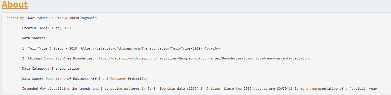
About
Aug 2018 - Dec 2022
Computer Science
Creating this portfolio for CS 424 bit by bit!
More
Coming
Soon!
Project 1
CTA Subway Data Visualization
Introduction
This is the first project in CS 424: Data Analysis and Visualization class.
The primary intention for creating this visualization is to display ridership data for the
CTA Train network for each station and years ranging from 2001 to 2021 in an easy-to-understand fashion.
This visualization is designed to run on a Touch-Screen wall at UIC with a ratio of 5,760 by 3,240 as per the assignment requirement.
This project uses R as the main language, the following packages (shiny, shinydashboard, lubridate, scales, ggplot2, DT, tidyr) to preprocess, manipulate,
and plot the data, RStudio as the primary development environment, and ShinyApps.io as the preferred location for the deployment of the app.
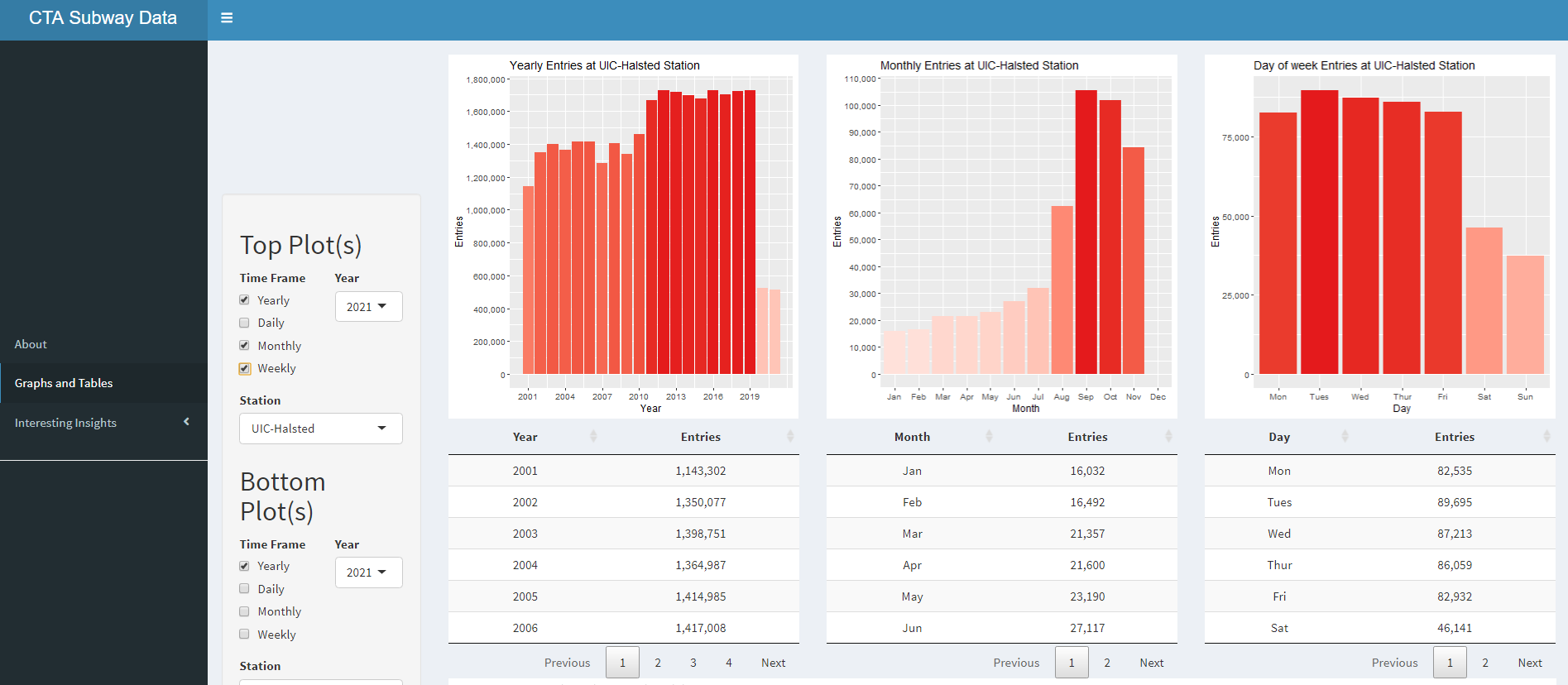
How to use
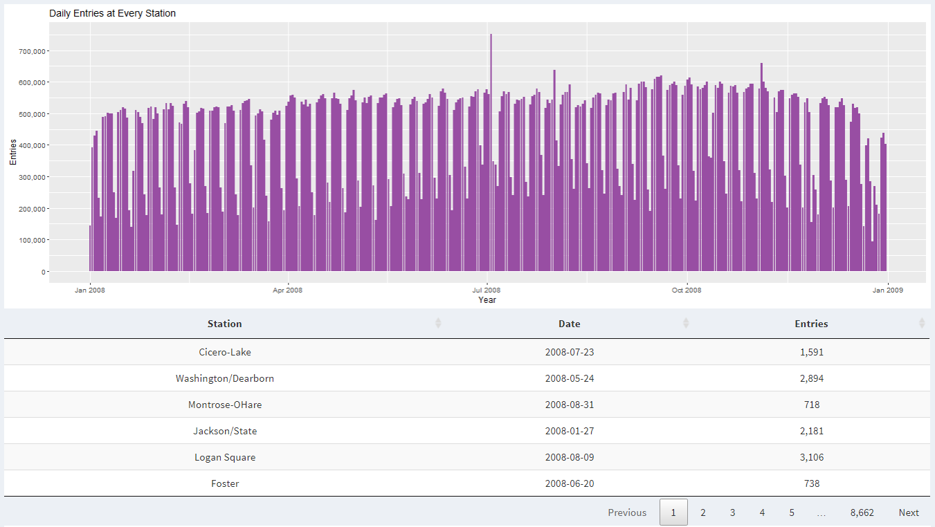
In this visualization, the data is displayed in a variety of bar graphs and data tables.
On the left, there are three menu options to chose from. "About" give a brief introduction to the project.
"Graphs and Tables" takes you to the body that is split into two displays.
Each portion of the display shows plots and corresponding data for the plot in a table.
They have their own set of controls so that you can manipulate two groups of graphs independently
Here you can specify what pair of graph and table you want to display together.
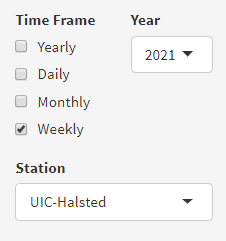
You can choose to display data in the form of yearly data for every year, each day in the year, each month in a year, and/or each day of the week in a year.
"Interesting insights" sets the control to point you towards an insight with a brief description regarding the insight.
For each group of plots, there are four types of control to customize how you would like to see that data.
The first thing you can do is control the time frame that you would like to hone in on.
For the time frame, there are four controls: Yearly, Daily, Monthly, and Weekly.
These controls can be selected and deselected in any combination to show the corresponding graph.
When "Yearly" is selected in Time Frame, the graph shows sum of data for each year in one bar plot.
When "Daily" is selected in Time Frame, the graph is shown for the range of time selected, whether that be one year or every year.
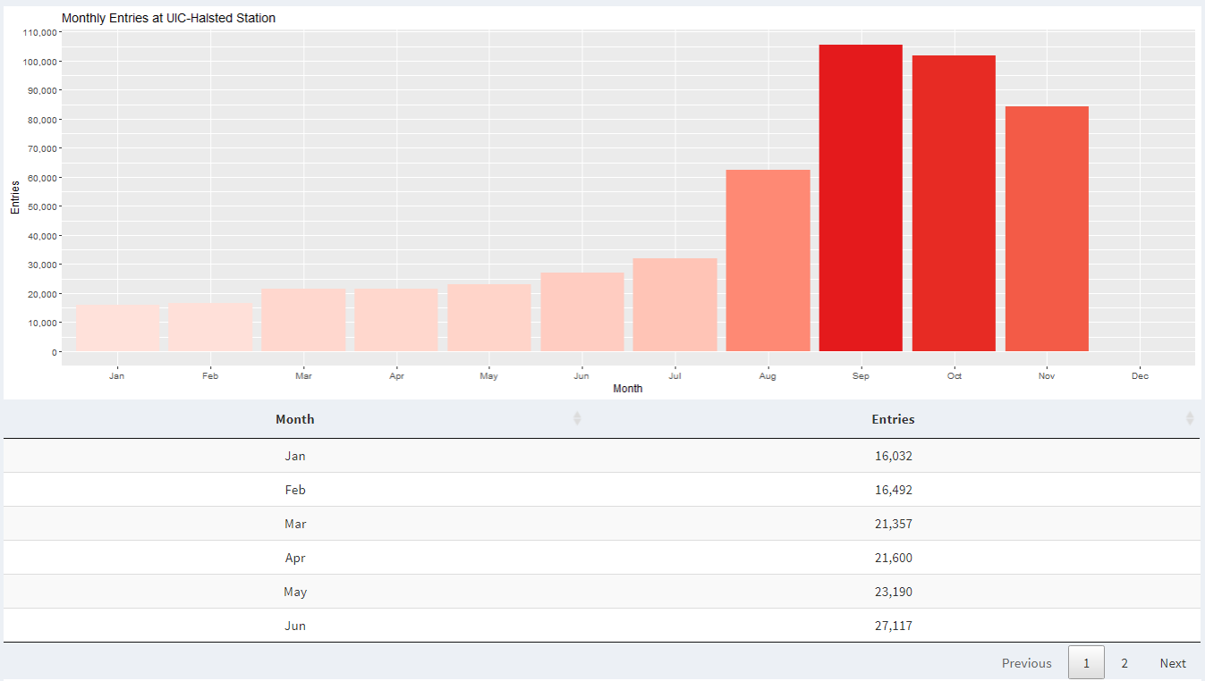
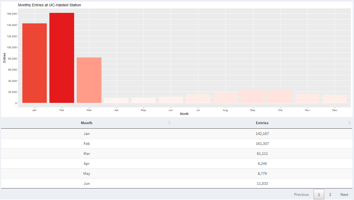
When "Monthly" is selected in Time Frame, the graph is shown to display data about the month for the selected time range, whether that be one year or every year.
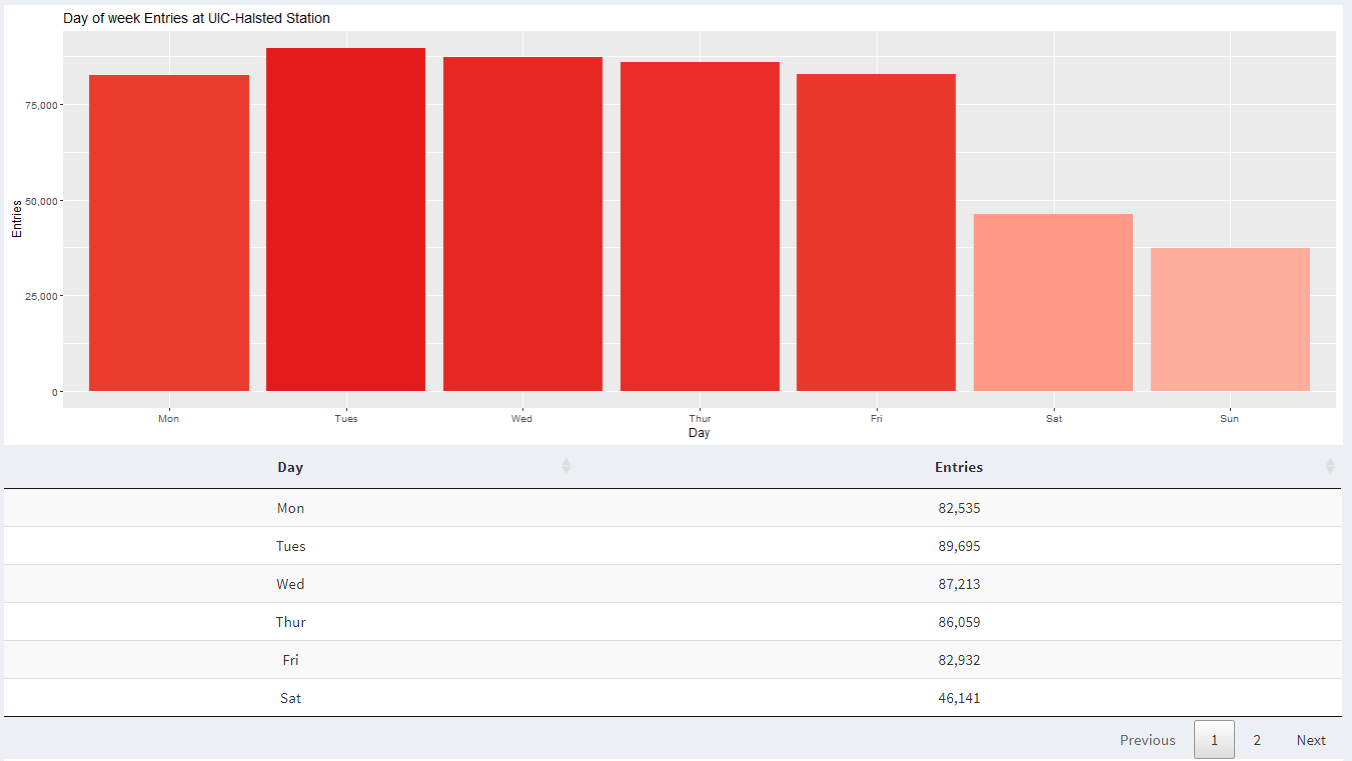
When "Weekly" is selected in Time Frame, the graph is shown to display data about each day of the week for the selected time range, whether that be one year or every year.
The second thing you can do is select a year to populate data about a single year for the selected station(s).
Furthermore, you can pick "Every" if you would like to see data from every year.
The third thing you can do with controls is filter data by following three stations: UIC-Halsted, O'Hare Airport, and Rosemont.
You can also pick "Every" if you would like to see data from every station for the selected time range.
Data attributes
The data used in this visualization is from cityofchicago.org, and the link to the data set is at the bottom.
From there I downloaded the TSV file that contains all the data needed for this visualization.
I knew I needed to upload this project to shinyapps.io and host website contains a 5 MB limit,
so I split the file up using a python script so that I can upload it to shinyapps.io where this project is hosted.
All the manipulation from here on is done in the R application.
First, I read each TSV file and converted it into one data frame so that it can be easily manipulated.
Then I created a new column for the date that uses internal format.
Afterward, I created three new columns for year, date, and month.
Then, I set each of those three columns to be set as numeric values.
Afterward, I created a column for the name of the month so that the month can be displayed in the graph.
Then, I created a new column for the day of the week so that it can be displayed in the graph as well.
Then I created a new column of char to show entries at each station with a comma in the number so that the user can
easily understand a big number while looking at the y-axis.
Next, I removed three columns that won't be used to make data manipulation ad processing faster when it comes time to display plots and tables.
After which, I corrected the station name of O'Hare Airport,
which was without the comma during the data parsing process to be able to capture the entirety of the data.
Then, I created three new data frames for each station.
In the later steps, I utilize the filtered data frames instead of calling the data frame that contains all the data to make rendering the plot faster.
That's how I preprocess the data for this project.
If you would like to use the data files to reproduce this project then those details can be found on GitHub page linked below.
It also contains data that are already split into chunks less than 5 MB so that it can be uploaded to shinyapps.io in the future.
Interesting Insights
Insight 1
Insight 2
Insight 3
Insight 4
Insight 5
Insight 6
Insight 7
Insight 8
Insight 9
Insight 10
Insight 1:
When we look at weekly data in 2021, we can see that there is increased activity at UIC-Halsted during weekdays compared to the weekend. This is because most classes are held from Monday to Friday.
Insight 2:
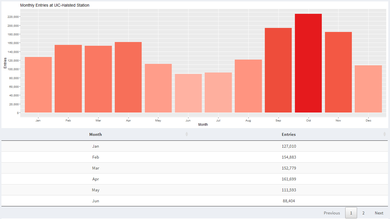
When we look at monthly data in 2021, we can see a significant increase in activity at UIC-Halsted around August and September compared to April and May. This is because we were in remote learning the last semester, while this semester we are in-person learning.
Insight 3:
When we look at monthly data in 2020, we can see that after February, there is a significant decrease in activity at UIC-Halsted. This is because the entire school went in remote learning due to COVID-19.
Insight 4:
When we look at monthly data for UIC-Halsted during the years 2020 and 2021, we can see that we were in remote learning for half of the Spring 2020 semester and the next full year.
Insight 5:
When we look at monthly data for UIC-Halsted and O'Hare airport for 2020, we see a similar trend of decrease in activity starting February. This is because CDC came with new guidelines for institutions to follow to slow the spread of coronavirus.
Insight 6:
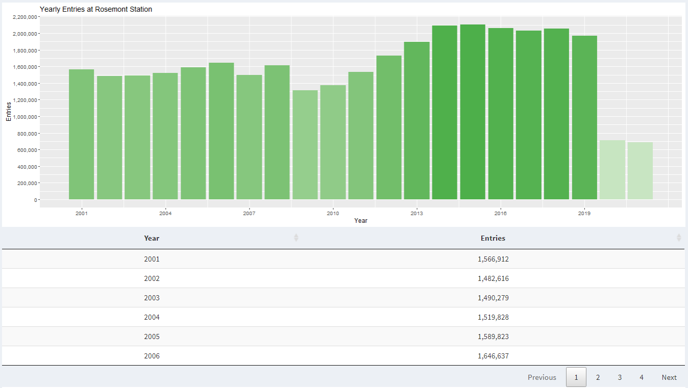
When we look at historic ridership data at Rosemont station, we can see a steady increase in passengers year over year.
Insight 7:
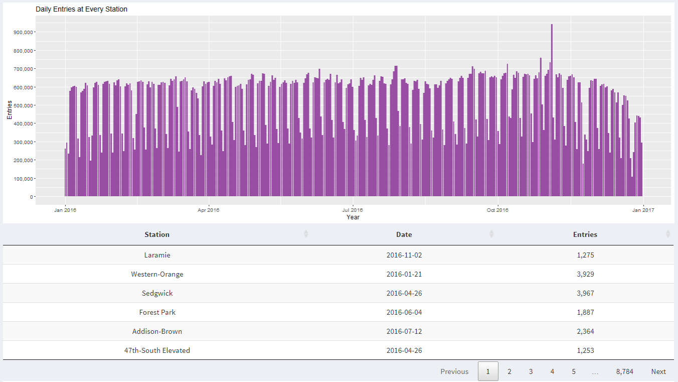
When we look at ridership data from all stations during 2016, we can see a spike in ridership on November 4, 2016. This is the same date when Cub's parade was held. Five days before the parade (October 29) was the day of the game that earned them world series.
Insight 8:
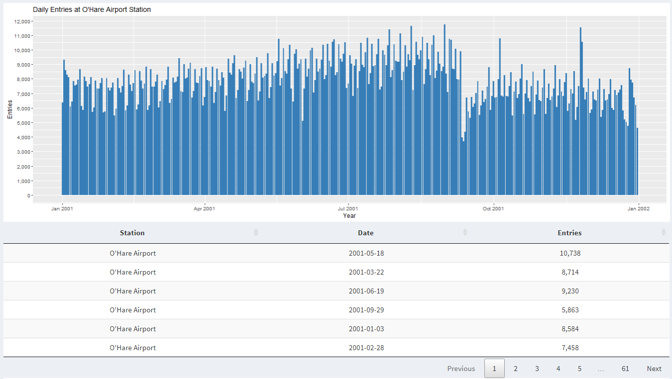
When we look at ridership data from O'Hare station during 2001, we see that around September there is a dip in activity. This is because there were attacks on Twin Towers in New York and there was a fear of flying for the next few months. Furthermore, during 2002 there was a dip in entries at O'Hare during September due to fear of another attack on a plane.
Insight 9:
Here we look at monthly data from 2018 at UIC-Halsted. We notice that there is a dip in ridership during May, June, July, and August because that's when UIC has summer vacation.
Insight 10:
Here when we look at November data for 2008, there is an overall increased activity at all CTA stations. This is because Obama held his presidential election acceptance speech at Grant Park in Chicago.
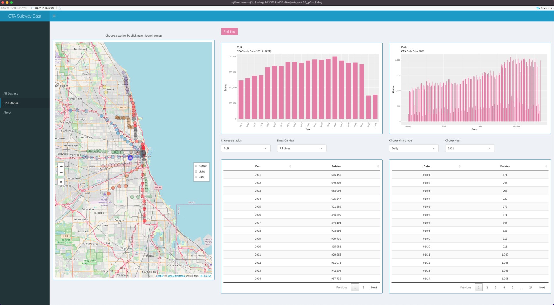
This project is intended for visualizing the geographic information of all
the CTA L stations and also to find out the trends and interesting patterns in Chicago 'L' Station ridership data.
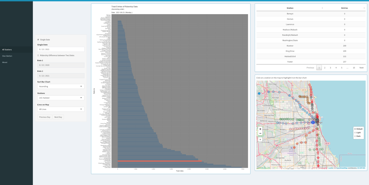
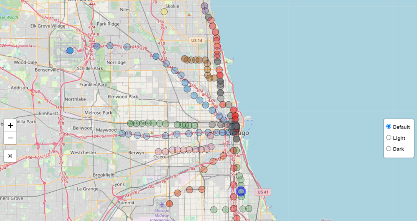
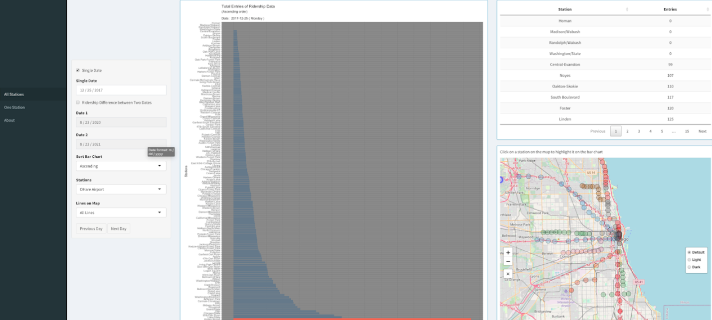
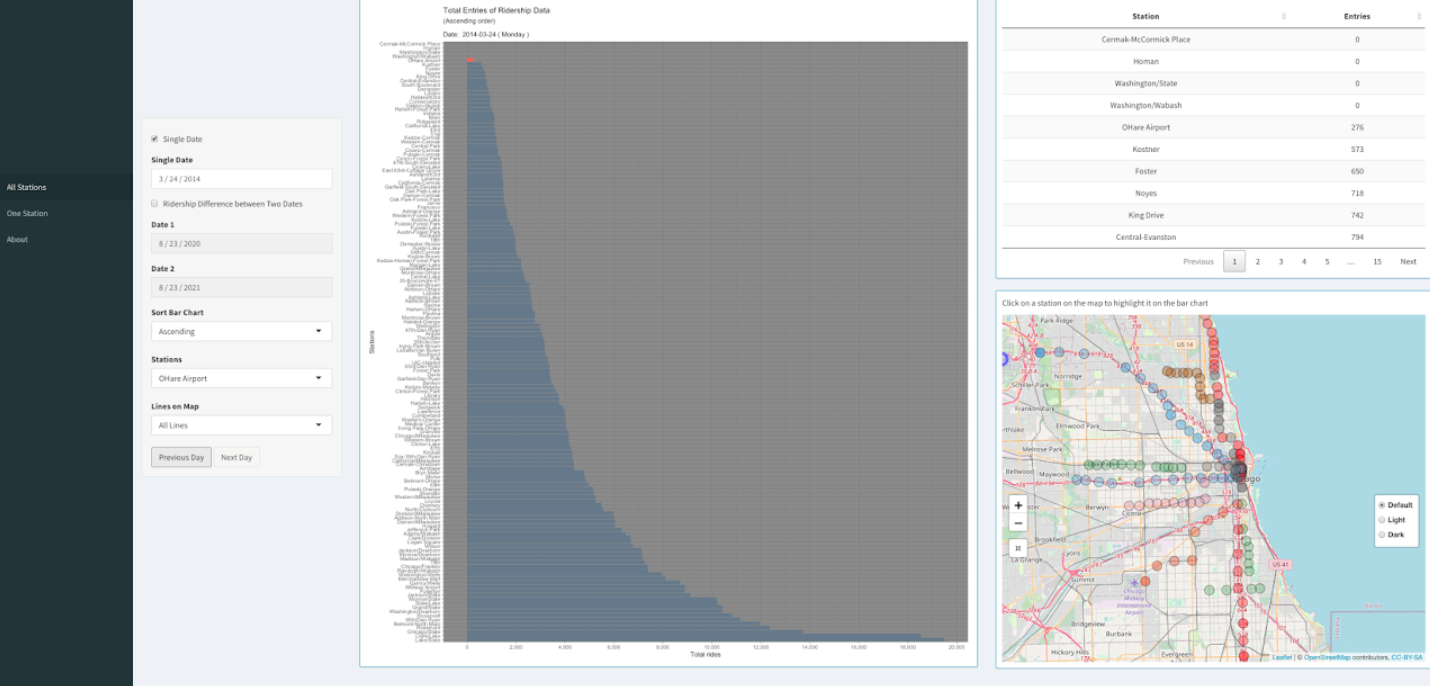
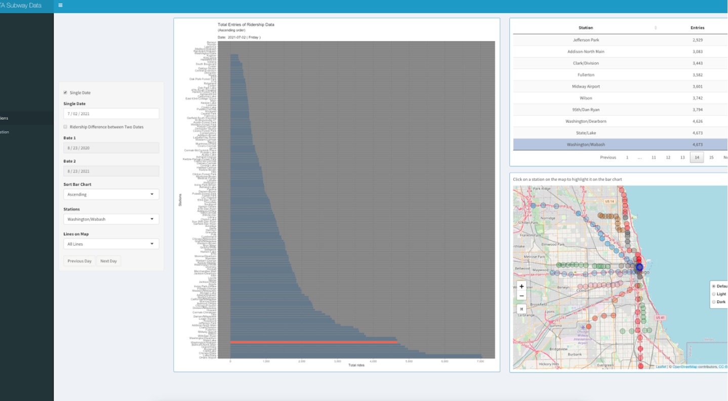
Bar chart on the first page ("All Stations") of the application shows total ridership entry of a single date of all the CTA stations.
The opacity of the stations on the map changes according to ridership entry.
Users can select a particular date using the option "Single Date" on the left side.
To highlight a station on the map and on the bar chart, the user can click on that station on the map or
use the dropdown menu "Stations" on the left. Users can also choose line colors using the dropdown menu "Lines on Map".
Initially "All lines" option is selected. Upon selecting a line color (ie: pink line),
the dropdown menu "Stations" will contain only the stations from the chosen line color.
The map will also display only those stations from the chosen line color. The bar chart can be sorted in ascending,
descending or alphabetic order using the dropdown menu "Sort Bar Chart" and the data table will also be sorted accordingly.
Users can easily navigate to previous or next date using the two buttons from bottom-left.
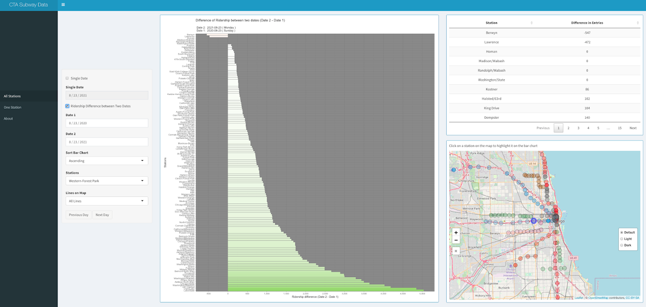
Upon selecting the checkbox "Ridership Difference between Two Dates",
users will be able to see the change in entries between two selected days (Date 1 and Date 2)
in a divergent color scheme on the bar chart. The data table and the map also change accordingly.
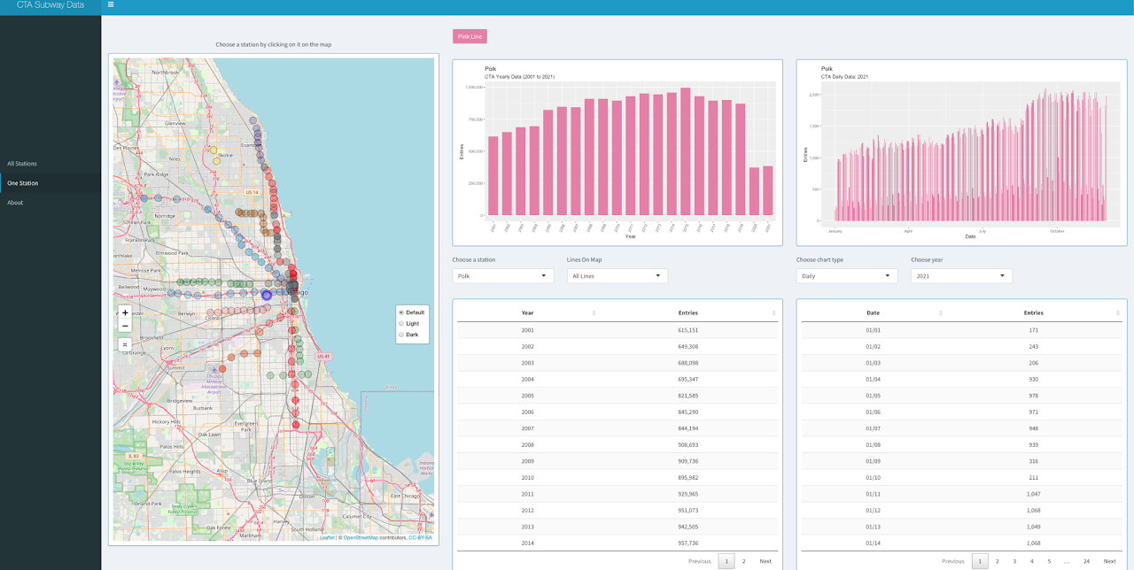
The second page ("One Station) gives users an overview of ridership data of a particular CTA station.
Users can select a particular station by clicking on it on the map or using the dropdown menu.
To narrow down the selection of station, users can choose a line color from the dropdown menu "Line On Map".
Initially "All Lines" option is selected. The yearly bar chart on the left will give a general overview of how
ridership data in a chosen CTA station changed over the years. On the right side, users can choose between three
chart types: daily, monthly, or weekdays. Users also have to select a particular year for which the chart on the
right side will be displayed. Users can also see the raw data below each chart.
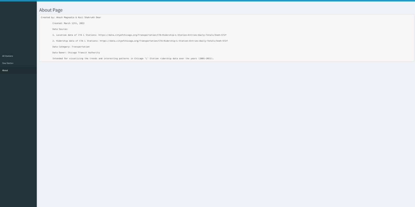
On the "About" page, some details are listed such as creators of the application, date published, data sources, data owner etc.
About the Data
Data Source
Two datasets were used to build the application.
Both datasets were collected from Chicago Data Portal.
Dataset that contains information about all the CTA L stops including their latitude and longitude can be found
here
The file size is 48KB.
Ridership data of all the CTA L stations can be found
here
The file size is 39MB.
Data Usage
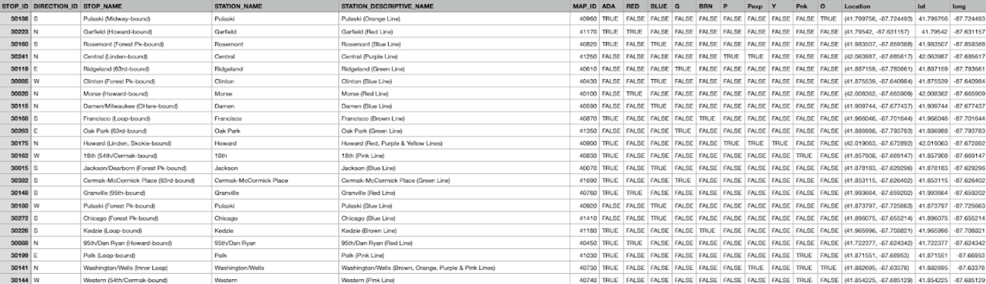
The CTA L stops information data provides location and basic service availability information for each place on the CTA system where a
train stops, along with formal station names, stop descriptions, and line colors (RED, BLUE, G (Green), O (Orange), BRN (Brown), P (Purple),
Pexp (Purple Express), Y (Yellow), and Pnk (Pink)). DIRECTION_ID refers to the normal direction of train traffic at a platform (E - East, W- West,
N - North, S - South). STOP_ID is a unique identifier for each stop and MAP_ID is a unique identifier for each station. ADA column tells if the stop
is ADA (American’s with Disability Act) compliant.
Table 1: CTA - System Information - List of 'L' Stops
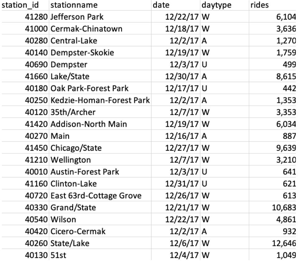
The ridership data contains entries of daily rides entries of all the CTA stations in Chicago starting 2001 to 2021.
The dataset shows entries at all turnstiles, combined, for each station. Daytypes are as follows: W = Weekday, A = Saturday, U = Sunday/Holiday.
Table 2: CTA L Station Ridership Data
The free web-based version of the Shiny server that was used to publish this project has a limit of 5 MB for each data file.
Thus, we split the ridership data file (39 MB) into smaller pieces to be able to upload it.
Python script used for splitting the ridership data and creating the TSV files is provided below:
#!/usr/bin/env python3

import csv
import os
import sys

os_path = os.path
csv_writer = csv.writer
sys_exit = sys.exit

if __name__ == '__main__':
   # number of rows per file
   chunk_size = 130000

   # file path to master tsv file
   file_path = "C:/Users/Akash/UIC/CS 424/tsv_splitter/CTA_-_Ridership_-__L__Station_Entries_-_Daily_Totals.tsv"

   if (
           not os_path.isfile(file_path) or
           not file_path.endswith('.tsv')
   ):
       print('You must input path to .tsv file for splitting.')
       sys_exit()

   file_name = os_path.splitext(file_path)[0]

   with open(file_path, 'r', newline='', encoding='utf-8') as tsv_file:

       chunk_file = None
       writer = None
       counter = 1
       reader = csv.reader(tsv_file, delimiter='\t', quotechar='\'')

       # get header_chunk
       header_chunk = None

       for index, chunk in enumerate(reader):
           header_chunk = chunk
           header_chunk[0] = header_chunk[0][1:]
           break

       for index, chunk in enumerate(reader):
           if index % chunk_size == 0:
               if chunk_file is not None:
                   chunk_file.close()

               chunk_name = '{0}_{1}.tsv'.format(file_name, counter)
               chunk_file = open(chunk_name, 'w', newline='', encoding='utf-8')
               counter += 1
               writer = csv_writer(chunk_file, delimiter='\t', quotechar='\'')
               writer.writerow(header_chunk)

               print('File "{}" complete.'.format(chunk_name))
           chunk[1] = chunk[1].replace("'", "")

           writer.writerow(chunk)
Interesting Findings
Insight 1
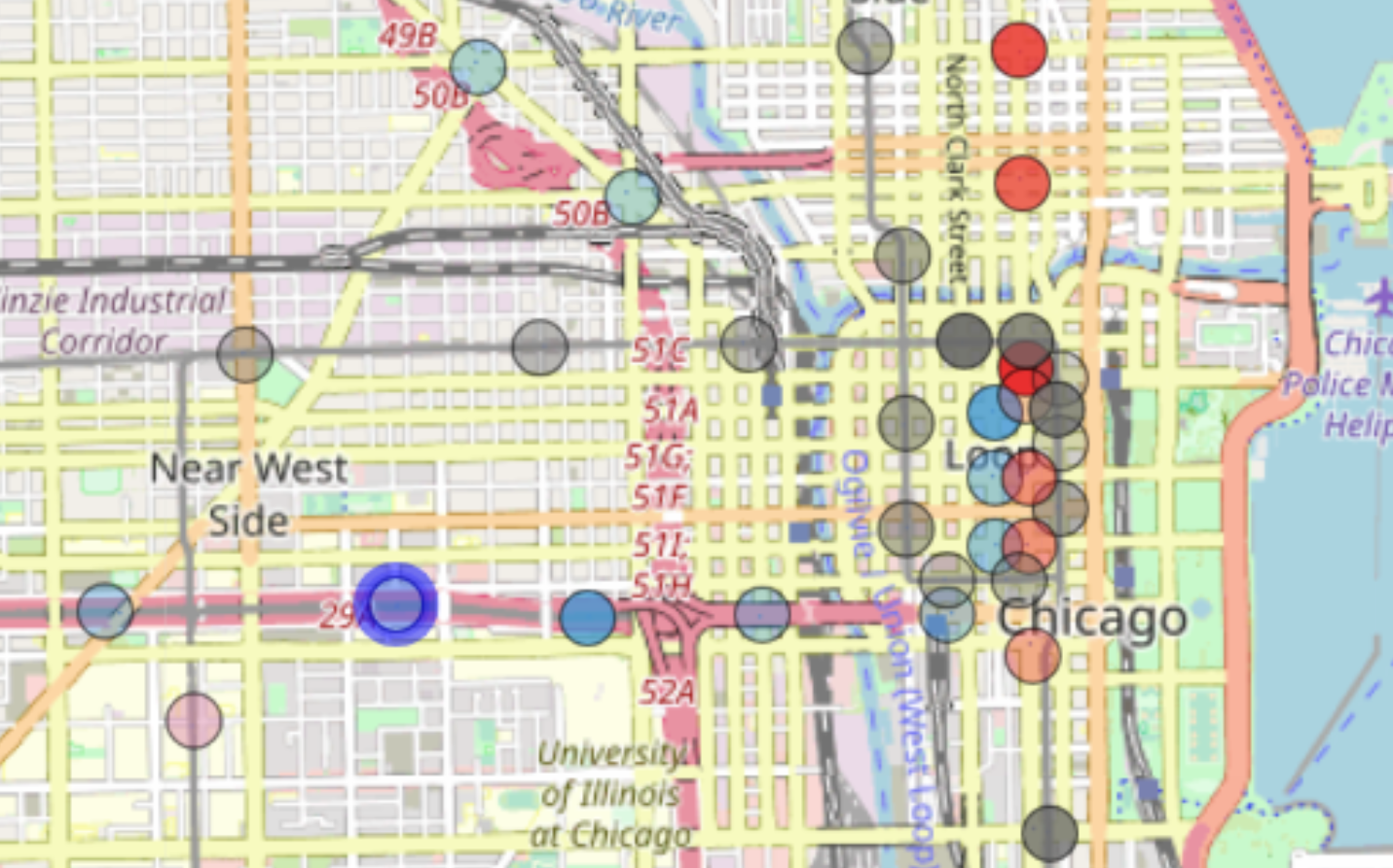
As we look at the data or, the opacity of each station on the map during 2021, it seems that there were more riders on Red Line than any other line.
We can also observe that O'Hare station has the most riders of all stations when we look at every line.
Insight 2
As we zoom in towards the loop, we can see that there are significantly more riders at stations in the loop and more ridership on Red Line
stations near the loop. One more interesting observation we can see is that the UIC-Halsted station stands out with darker blue shade as it
contains more than usual entries, which can be explained by the fact that about 85% of UIC students commute to the university.
Insight 3
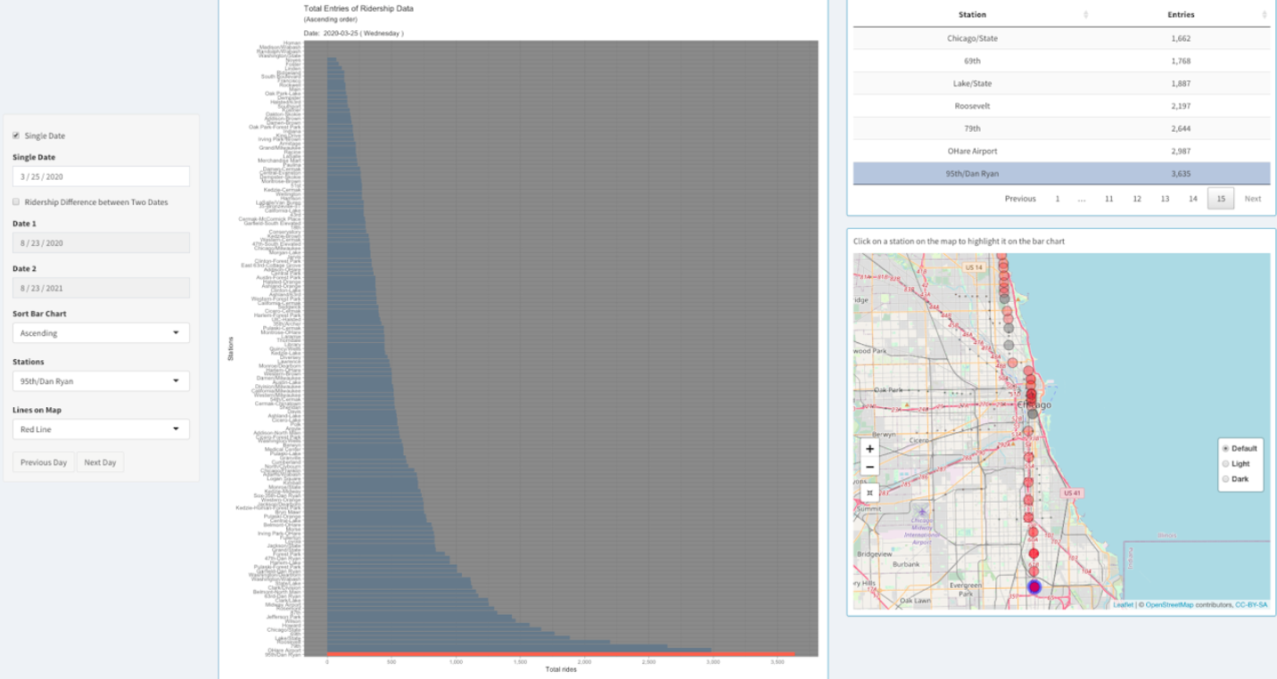
Among all the Red line CTA stations, 95th/Dan Ryan was the busiest during Covid lockdown restrictions.
It was also the third-busiest CTA station in 2020.
Source
.
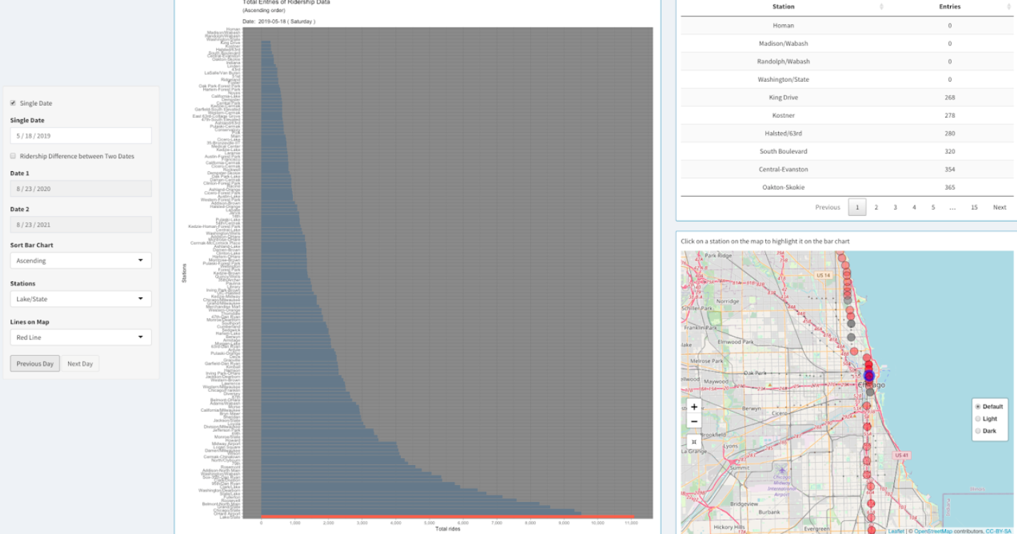
Insight 4
In 2019, Lake/State had an average of 19,364 weekday passenger entries, making
it the busiest 'L' station.
Source.
During the Covid restrictions, it lost momentum in ridership. But after the restrictions were removed,
it again became the busiest red line station.
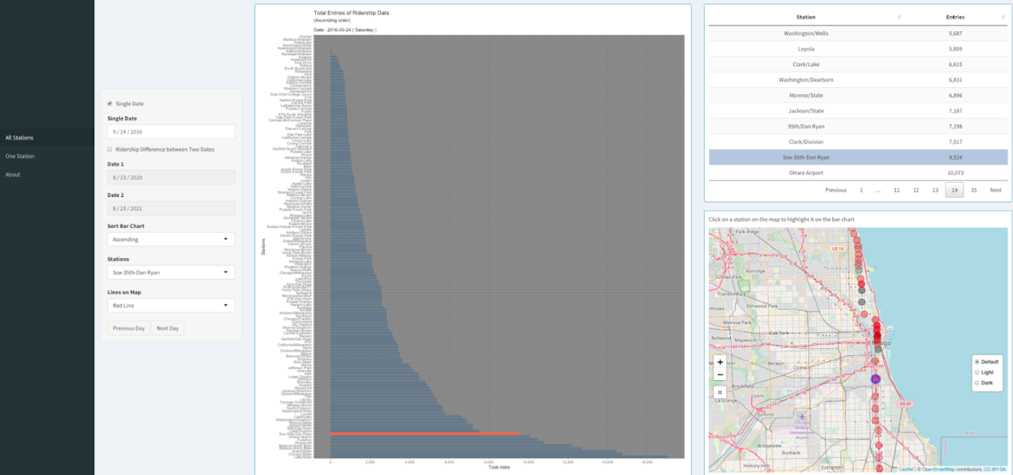
Insight 5
Sox 35th Dan Ryan station usually has low number of riders but during games or concerts at Chicago
White Sox stadium the ridership data spikes. On September 24, 2016, Chicago White Sox stadium had a record
attendance of 47,754 hosting a concert of Chance the Rapper.
Source.
Thus, we can see that the Sox 35th Dan Ryan station almost had as many entries of ridership as O'Hare Airport that day.
Insight 6
As we can clearly see, most of the CTA stations have very less ridership entries on Christmas day (Dec 25th).
However, O'Hare remains busy as numerous people fly to and from Chicago Airports during Christmas.
Source.
Insight 7
On March 24, 2014 at 2:50 a.m. local time, a CTA passenger train overran the bumper at O'Hare, injuring 34 people.
Following the accident, the line between O'Hare and Rosemont was closed, with a replacement bus service in place.
We can clearly see from the bar chart, that due to that incident there were almost no ridership entries on OHare station on 24th March and the following week.
Insight 8
The Grant Park Music Festival is a ten-week (Jul 2 – Aug 21, 2021) classical music concert series held annually in Chicago,
Illinois, United States. During this time Washington/Wabash station remains busy as it is the public transport access to Grant Park.
Also, the station remains busy as Millennium Park is a very popular destination for visitors.
This project is intended for visualizing the trends and interesting patterns
in Taxi ridership data (2019) in Chicago. We are choosing to look at data from 2019
data is because it is pre-COVID data and more representative of a 'typical' year.
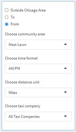
Let us focus our attention on the left-hand side, where the controls are placed. The visualization starts with
Chicago as a chosen community area, which means data from every community in Chicago is aggregated. Furthermore, the user
can select the Outside Chicago Area checkbox to also include the data for when the taxi ride started or ended in Chicago.
Next, the user can go ahead by selecting West Lawn as the community area, after which From and To radio buttons come to life
as they are enabled. Here we can specify and aggregate data for only when the trip started from West Lawn and ended
somewhere in Chicago, or when the trip started somewhere in Chicago and ended in West Lawn. This is assuming the fact that
the Outside Chicago Area is deselected. If the Outside Chicago Area is selected when West Lawn is chosen as the community
area then the following is how the data would be aggregated: Trip started from or ended in West Lawn regardless of
destination or starting point, respectively. Next, the user can select between the time formats: 12-hour or 24-hour. These
changes are reflected in the bar graph and the table where time is displayed. Next, the user can select a distance unit
between either Miles or Kilometers. These changes are reflected in the bar graph and the table where time is displayed.
Next, the user can select whether they want to look at data from a specific taxi company or display data from all the companies.
This helps the user investigate specific statistics about an individual taxi company.
On the "About" page, some details are listed such as creators of the application, date published, data sources, data owner, etc.
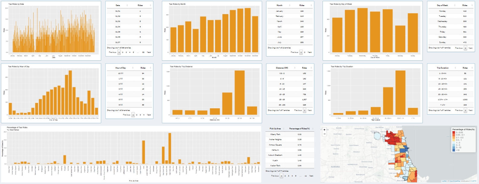
Graphs, Tables and Map
Next, we will look at graphs and tables associated with the graphs. Then at the end, we will look at a map that
displays ridership data per community. The data displayed in the graph adapts based on the controls we explored above.
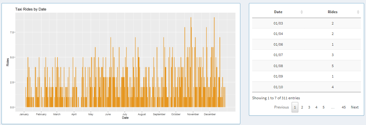
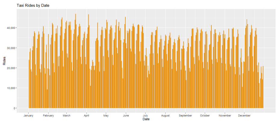
Taxi Rides by Date
On the left-hand side, the graph displays one bar for each day of 2019 and each bar represents rides for that day.
On the right-hand side, the same data can be explored in a tabular format, where users can look at individual data points.
The table can be sorted in an ascending or descending order for each column.
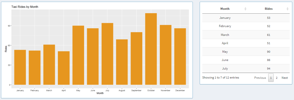
Taxi Rides by Month
On the left-hand side, the graph displays one bar for each month of 2019 and each bar represents rides for that month.
On the right-hand side, the same data can be explored in a tabular format, where users can look at data aggregated for each month.
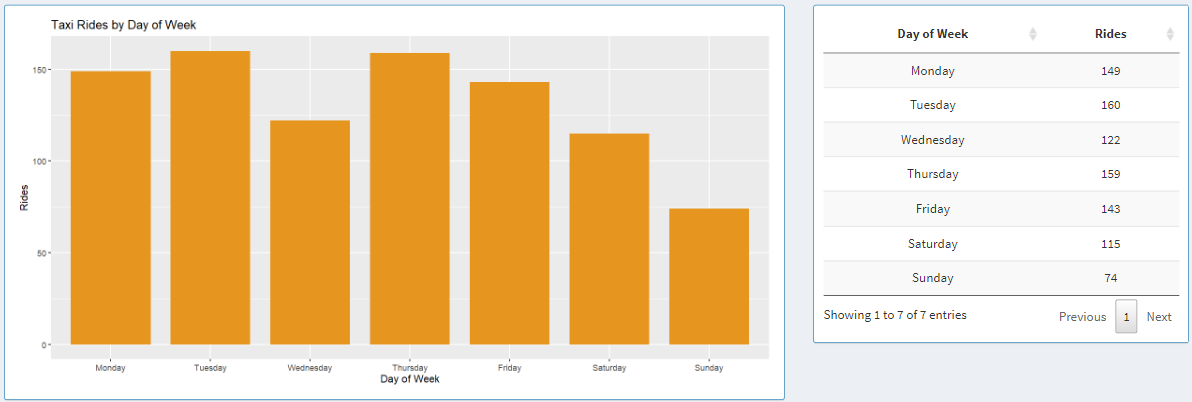
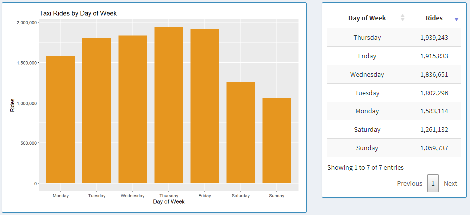
Taxi Rides by Day of the Week
Here, the graph displays aggregated data for each day of the week in 2019 starting from Monday to Sunday.
Next to the graph, we can see the data shown in a table, where each column can be sorted in ascending or descending order by clicking on the column names.
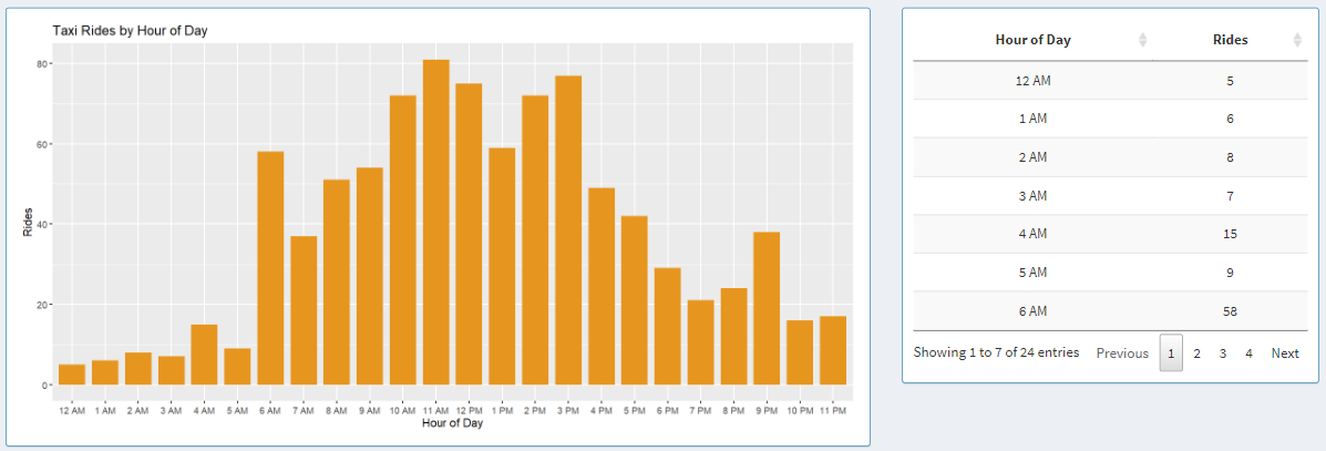
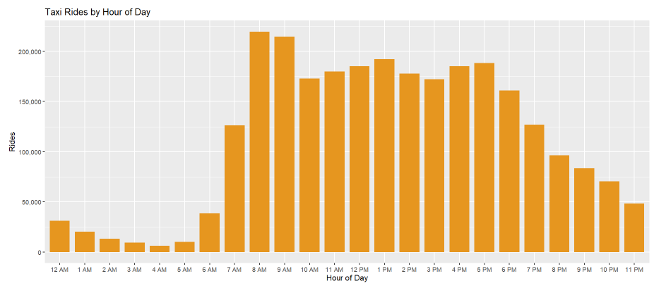
Taxi Rides by Hour of Day
Next, we have taxi rides by the hour of the day. Here, the graph shows aggregated data about each day in 2019.
The x-axis adapts to a 12-hour or 24-hour format based on the controls that we explored in the earlier section.
Next to the graph, we can see the data from the graph shown in a table, where the data can be sorted in ascending or descending
order by clicking on the column names in the table.
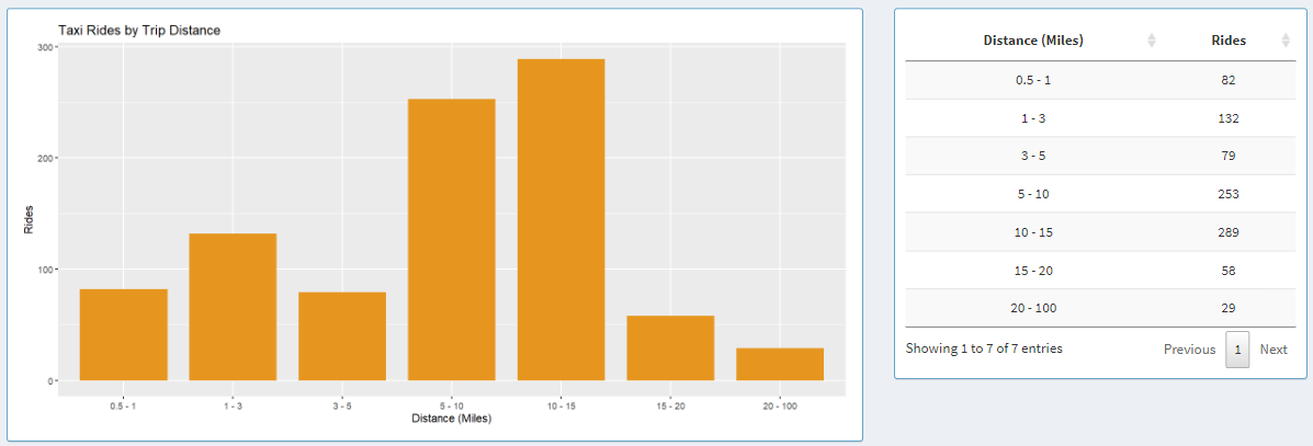
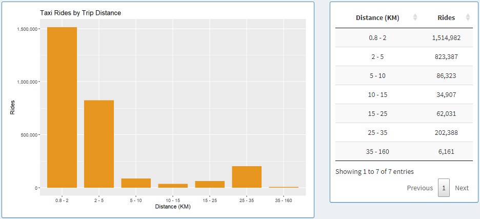
Taxi Rides by Trip Distance
Here we have a graph that shows data based on trip range.
The trip distance can be adapted to two distance formats based on the controls on the left side: Miles and Kilometers.
When Kilometers is selected, ranges are broken down based on the following bins: 0.8 - 2, 2 - 5, 5 - 10, 10 - 15, 15 - 25, 25 - 35, 35 - 160.
When Miles is selected, ranges are broken down based on the following bins: 0.5 - 1, 1 - 3, 3 - 5, 5 - 10, 10 - 15, 15 - 20, 20 - 100.
Next to the graph, we can see the data from the graph shown in a table, where the data can be sorted by trip range or
rides count for each bin in ascending or descending order by clicking on the column names in the table.
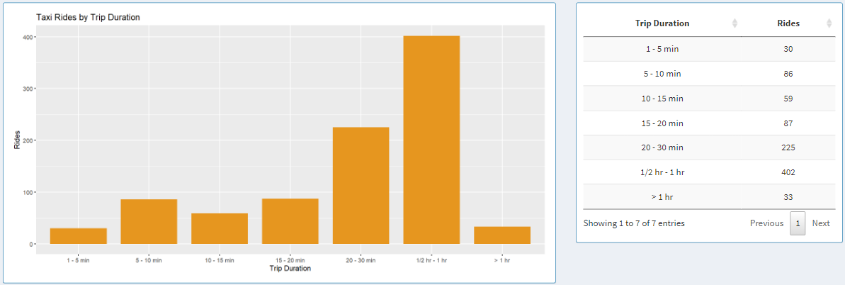
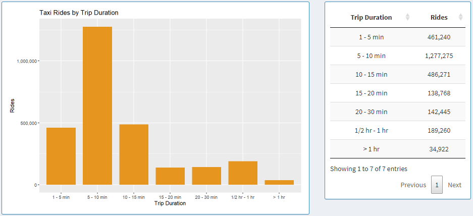
Taxi Rides by Trip Duration
Here we have a graph that shows data based on trip duration.
The time duration is broken down into 7 subset: 1 - 5 min, 5 - 10 min, 10 - 15 min, 15 - 20 min, 15 - 20, 20 - 30 min, 1/2 hr - 1 hr, > 1 hr.
Each bar in the graph and each table entry in the table represents each one of those bins.
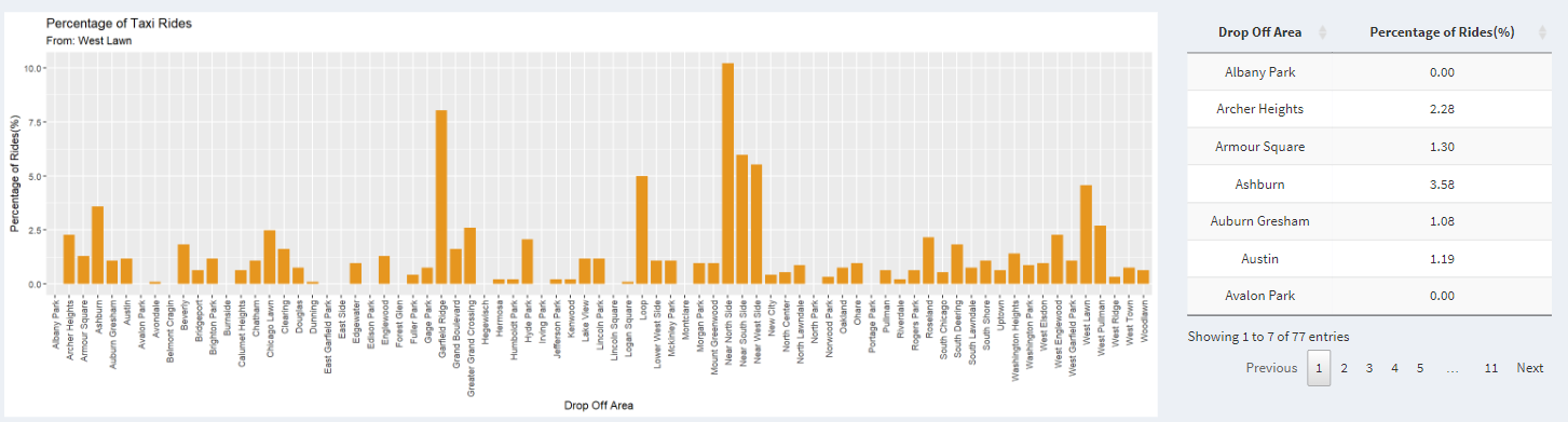
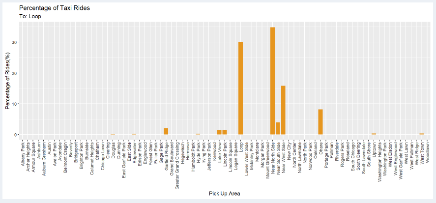
Percentage of Taxi Rides
Here, the x-axis represents either the destination or the starting point based on whether the user clicks the radio button To or From.
The y-axis represents the percentage of riders traveling from one point to another. It makes more sense when we look at the title.
Let us select West Lawn as the community area and click on the To radio button.
The graph shows the percentage of riders traveling from the community area on the graph to West Lawn.
On the right-hand side, we have a table that displays the same data but in a tabular format.
The percentage can be sorted from low to high or vice-versa.
The name can also be sorted by the pick-up area or drop-off area depending on where you chose To or From on the radio button, respectively.
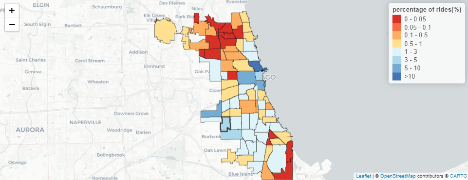
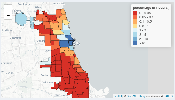
Map of Percentage of Taxi Rides
Furthermore, the data we looked at in the graph is also represented on the map with a heat map.
On the upper right of the map, we have legends that go from Red color to Blue color hue representing low to high percentages of riders.
Additionally, the community area can be selected by clicking on the community area on the map.
When you hover over the community area on the map, you can also see the name and percentage of riders traveling from or to that community area.
About the Data
Data Source
Two datasets were used to build the application.
Both datasets were collected from Chicago Data Portal.
The dataset that contains information about Taxi rides in Chicago for 2019 can be found
here.
The file size is about 7GB.
The dataset that contains information regarding boundaries for each community area in Chicago can be found
here.
The file size is about 2MB.
Data Usage
The taxi trips from the 2019 dataset contain 23 columns of which we are only concerned with looking at 6 of them for this visualization.
Trip Start Timestamp is a string that describes when the trip started, rounded to the nearest 15 minutes.
Trip Seconds is an integer that describes the time of the trip in seconds.
Trip Miles is a float that describes the distance of the trip in miles.
Pickup Community Area is an integer that describes the Community Area where the trip began and this column would be blank for locations outside Chicago.
Dropoff Community Area is an integer that describes the Community Area where the trip ended and this column would be blank for locations outside Chicago.
Company is a string that describes the taxi company that ran that specific taxi service for the trip.
The Boundaries - Community Areas dataset contains information about the boundaries of each community area in Chicago.
This data is downloadable in GEOJSON format, which can be further used to describe each community with a color on a map in RStudio.
Data pre-processing
The (Electronic Visualization Laboratory) EVL shiny-server at UIC was used to publish this project.
To make the project responsive and create the start-up time as quickly as possible, we split up the data into various subfolders with their CSV files.
Two datasets need to be downloaded, both of which are provided at the bottom of the page.
Python script used for splitting the ridership data is provided below:
import os
import numpy as np
import pandas as pd
import csv
from datetime import datetime
import warnings
warnings.filterwarnings("ignore")

def mkdir(dir):
    if not os.path.exists(dir):
        os.mkdir(dir)

def preprocess(df, dictCompany):

    df = df[['Trip Seconds', 'Trip Miles', 'Pickup Community Area', 'Dropoff Community Area', 'Company', 'Trip Start Timestamp']]
    df = df[(df['Trip Miles']>=0.5) & (df['Trip Miles']<=100)]
    df['tripKM'] = df['Trip Miles'].apply(lambda x: round(x*1.609,2))
    df = df[(df['Trip Seconds']>=60) & (df['Trip Seconds']<=18000)]
    df['Pickup Community Area'] = df['Pickup Community Area'].mask( ~((df['Pickup Community Area']>=1) & (df['Pickup Community Area']<=77)), 78)
    df['Dropoff Community Area'] = df['Dropoff Community Area'].mask( ~((df['Dropoff Community Area']>=1) & (df['Dropoff Community Area']<=77)), 78)
    df = df[~((df['Pickup Community Area']==78) & (df['Dropoff Community Area']==78))]
    df = df.replace({"Company": dictCompany})
    df = df.dropna()
    df['Trip Start Timestamp'] = pd.to_datetime(df['Trip Start Timestamp'])
    df['Trip Start Timestamp'] = df['Trip Start Timestamp'].apply(lambda x: pd.datetime(x.year, x.month, x.day, x.hour, 0, 0))
    df['Pickup Community Area'] = df['Pickup Community Area'].astype(int)
    df['Dropoff Community Area'] = df['Dropoff Community Area'].astype(int)
    df['Trip Seconds'] = df['Trip Seconds'].astype(int)
    df = df.rename(columns={'Trip Seconds': 'tripSeconds', 'Trip Miles': 'tripMiles', 'Pickup Community Area': 'pickupArea', 'Dropoff Community Area': 'dropArea', 'Company': 'company', 'Trip Start Timestamp': 'tripStartTime'})

    return df


def preCalc(df, str, drop=False, pick=False, outChicago=False):

    df_date = df.groupby([df['tripStartTime'].dt.date]).size().to_frame().reset_index().rename(columns={'tripStartTime': 'Date',0: 'Count'})
    df_hour = df.groupby([df['tripStartTime'].dt.hour]).size().to_frame().reset_index().rename(columns={'tripStartTime': 'Hour', 0: 'Count'})
    df_day = df.groupby([df['tripStartTime'].dt.dayofweek]).size().to_frame().reset_index().rename(columns={'tripStartTime': 'Day', 0: 'Count'})

     # Values: 0 to 6. (0: Monday, 6: Sunday)
    df_month = df.groupby([df['tripStartTime'].dt.month]).size().to_frame().reset_index().rename(columns={'tripStartTime': 'Month', 0: 'Count'})

    df_mileage_miles = df
    ranges_miles = [0.49, 1, 3, 5, 10, 15, 20, 100]
    df_mileage_miles['mileage_bin_miles'] = pd.cut(df['tripMiles'], bins=ranges_miles)
    df_mileage_miles = df_mileage_miles.groupby([df_mileage_miles['mileage_bin_miles']]).size().to_frame().reset_index().rename(columns={'mileage_bin_miles': 'Mileage_miles', 0: 'Count'})
    df_mileage_miles.sort_values(by='Mileage_miles')
    labels = ['0.5 - 1', '1 - 3', '3 - 5', '5 - 10', '10 - 15', '15 - 20', '20 - 100']
    df_mileage_miles['Mileage_miles'] = df_mileage_miles['Mileage_miles'].cat.rename_categories(labels)

    df_mileage_km = df
    ranges_km  = [0.79, 2, 5, 10, 15, 25, 35, 160.0]
    df_mileage_km['mileage_bin_km'] = pd.cut(df['tripKM'], bins=ranges_km)
    df_mileage_km = df_mileage_km.groupby([df_mileage_km['mileage_bin_km']]).size().to_frame().reset_index().rename(columns={'mileage_bin_km': 'Mileage_km', 0: 'Count'})
    df_mileage_km.sort_values(by='Mileage_km')
    labels = ['0.8 - 2', '2 - 5', '5 - 10', '10 - 15', '15 - 25', '25 - 35', '35 - 160']
    df_mileage_km['Mileage_km'] = df_mileage_km['Mileage_km'].cat.rename_categories(labels)

    df_time = df
    ranges = [59.99, 300, 600, 900, 1200, 1800, 3600, np.inf]
    df_time['time_bin'] = pd.cut(df['tripSeconds'], bins=ranges)
    df_time = df_time.groupby([df_time['time_bin']]).size().to_frame().reset_index().rename(columns={'time_bin': 'timeTaken', 0: 'Count'})
    df_time.sort_values(by='timeTaken')
    labels = ['1 - 5 min', '5 - 10 min', '10 - 15 min', '15 - 20 min', '20 - 30 min', '1/2 hr - 1 hr',  '> 1 hr']
    df_time.timeTaken = df_time.timeTaken.cat.rename_categories(labels)

    df_date.to_csv(str+'date.csv', index=False)
    df_hour.to_csv(str+'hour.csv', index=False)
    df_day.to_csv(str+'day.csv', index=False)
    df_month.to_csv(str+'month.csv'.format(str), index=False)
    df_mileage_miles.to_csv(str+'mileage_miles.csv'.format(str), index=False)
    df_mileage_km.to_csv(str+'mileage_km.csv'.format(str), index=False)
    df_time.to_csv(str+'time.csv'.format(str), index=False)

    if(drop):
        dfDrop = df.groupby([df['dropArea']]).size().to_frame().reset_index().rename(columns={0: 'Percentage'})
        dfDrop['Percentage'] = round((100. * dfDrop['Percentage'] / dfDrop['Percentage'].sum()),2)
        if(outChicago):
            n=79
        else:
            n=78
        for i in range(1,n):
            if(i not in dfDrop['dropArea'].tolist()):
                add = {'dropArea':i, 'Percentage':0}
                dfDrop = dfDrop.append(add, ignore_index = True)

        dfDrop = dfDrop.sort_values(by=['dropArea'],ignore_index=True)
        dfDrop.to_csv(str+'drop.csv'.format(str), index=False)

    if(pick):
        dfPick = df.groupby([df['pickupArea']]).size().to_frame().reset_index().rename(columns={0: 'Percentage'})
        dfPick['Percentage'] = round((100. * dfPick['Percentage'] / dfPick['Percentage'].sum()),2)
        if(outChicago):
            n=79
        else:
            n=78
        for i in range(1,n):
            if(i not in dfPick['pickupArea'].tolist()):
                add = {'pickupArea':i, 'Percentage':0}
                dfPick = dfPick.append(add, ignore_index = True)

        dfPick = dfPick.sort_values(by=['pickupArea'],ignore_index=True)
        dfPick.to_csv(str+'pick.csv'.format(str), index=False)


filename = "Taxi_Trips_-_2019.csv"
df = pd.read_csv(filename)

with open('taxiDict.csv') as csv_file:
    reader = csv.reader(csv_file)
    mydict = dict(reader)

dictCompany = dict((v, int(k)) for k, v in mydict.items())

dfTaxi = preprocess(df, dictCompany)


# All Areas All Taxi
mkdir("allAreaAllTaxi")
mkdir("allAreaAllTaxi/outsideCity/")
mkdir("allAreaAllTaxi")
mkdir("allAreaAllTaxi/onlyCity/")

preCalc(dfTaxi, "allAreaAllTaxi/outsideCity/")
dfTaxiSub = dfTaxi[~((dfTaxi['pickupArea']==78) | (dfTaxi['dropArea']==78))]
preCalc(dfTaxiSub, "allAreaAllTaxi/onlyCity/")


# All Taxi Pickup Areas

mkdir("allTaxi")
mkdir("allTaxi/From")

for i in range(1,78):
    dir = "allTaxi/From/Area-{}/".format(i)
    mkdir(dir)

    sub = dfTaxi[dfTaxi['pickupArea']==i]
    dir = "allTaxi/From/Area-{}/outsideCity/".format(i)
    mkdir(dir)
    preCalc(sub, dir, True, False, True)

    sub = dfTaxiSub[dfTaxiSub['pickupArea']==i]
    dir = "allTaxi/From/Area-{}/onlyCity/".format(i)
    mkdir(dir)
    preCalc(sub, dir, True, False, False)


# All Taxi Dropoff Areas
# Percentage Coming From

mkdir("allArea")
mkdir("allTaxi")
mkdir("allTaxi/To")

for i in range(1,78):
    dir = "allTaxi/To/Area-{}/".format(i)
    mkdir(dir)

    sub = dfTaxi[dfTaxi['dropArea']==i]
    dir = "allTaxi/To/Area-{}/outsideCity/".format(i)
    mkdir(dir)
    preCalc(sub, dir, False, True, True)

    sub = dfTaxiSub[dfTaxiSub['dropArea']==i]
    dir = "allTaxi/To/Area-{}/onlyCity/".format(i)
    mkdir(dir)
    preCalc(sub, dir, False, True, False)


# All Areas
mkdir("allArea")

for i in range(55):
    dir = "allArea/Taxi-{}/".format(i)
    mkdir(dir)

    sub = dfTaxi[dfTaxi['company']==i]
    dir = "allArea/Taxi-{}/outsideCity/".format(i)
    mkdir(dir)
    preCalc(sub, dir)

    sub = dfTaxiSub[dfTaxiSub['company']==i]
    dir = "allArea/Taxi-{}//onlyCity/".format(i)
    mkdir(dir)
    preCalc(sub, dir)


# Taxi - Area (To/From) All Combinations
mkdir("allCombination")

for i in range(55):
    dir = "allCombination/Taxi-{}/".format(i)
    mkdir(dir)
    mkdir(dir+"From/")
    mkdir(dir+"To/")

    for j in range(1,78):
        dir = "allCombination/Taxi-{}/From/Area-{}".format(i,j)
        mkdir(dir)

        dir = "allCombination/Taxi-{}/From/Area-{}/onlyCity/".format(i,j)
        mkdir(dir)
        sub = dfTaxiSub[(dfTaxiSub['company']==i) & (dfTaxiSub['pickupArea']==j)]
        preCalc(sub, dir, True, False, False)

        dir = "allCombination/Taxi-{}/From/Area-{}/outsideCity/".format(i,j)
        mkdir(dir)
        sub = dfTaxi[(dfTaxi['company']==i) & (dfTaxi['pickupArea']==j)]
        preCalc(sub, dir, True, False, True)

        dir = "allCombination/Taxi-{}/To/Area-{}".format(i,j)
        mkdir(dir)

        dir = "allCombination/Taxi-{}/To/Area-{}/onlyCity/".format(i,j)
        mkdir(dir)
        sub = dfTaxiSub[(dfTaxiSub['company']==i) & (dfTaxiSub['dropArea']==j)]
        preCalc(sub, dir, False, True, False)

        dir = "allCombination/Taxi-{}/To/Area-{}/outsideCity/".format(i,j)
        mkdir(dir)
        sub = dfTaxi[(dfTaxi['company']==i) & (dfTaxi['dropArea']==j)]
        preCalc(sub, dir, False, True, True)
Interesting Insights
Insight 1
When looking at all community area in Chicago,
I find it interesting that there are some gaps during the end of January, the start of April, the end of May, the start of July, the start of September, and the end of November.
There are also minor gaps in the graph which might be because of low ridership during weekends.
Insight 2
Looking at this insight backs up our theory about the second part of insight 1.
There are low ridership data in Chicago during weekends and highest ridership on Thursdays and Fridays as can be seen on the bar graph and data table.
Insight 3
Here we are looking data from only the Loop.
When we look at 8 AM, 9 AM, 4 PM and 5 PM, there is a relative spike in ridership compared to the other times around those specific time of the day.
This can be explained by the fact that those are rush-hour times.
Insight 4
Here we are looking at data from only the Loop.
The majority of the rides are between 0.8 and 2 Kilometers.
This might be because the customers are mostly traveling within the loop.
Insight 5
Here we are looking at data from only the Loop.
The majority of the rides are between 5 and 10 minutes.
This furthermore supports our claims from insight 4 that most of the riders in the loop are traveling small distances and possibly within the loop.
Insight 5
Here we are looking at data from only the Loop.
The previous two insights can be furthermore supported as about 1/4 of the riders are traveling within the loop.
Insight 6
Here we are looking at data from only the Loop.
As we can see from the map, most of the riders who take the taxi from the loop don't
travel much farther than the loop if not within the loop.
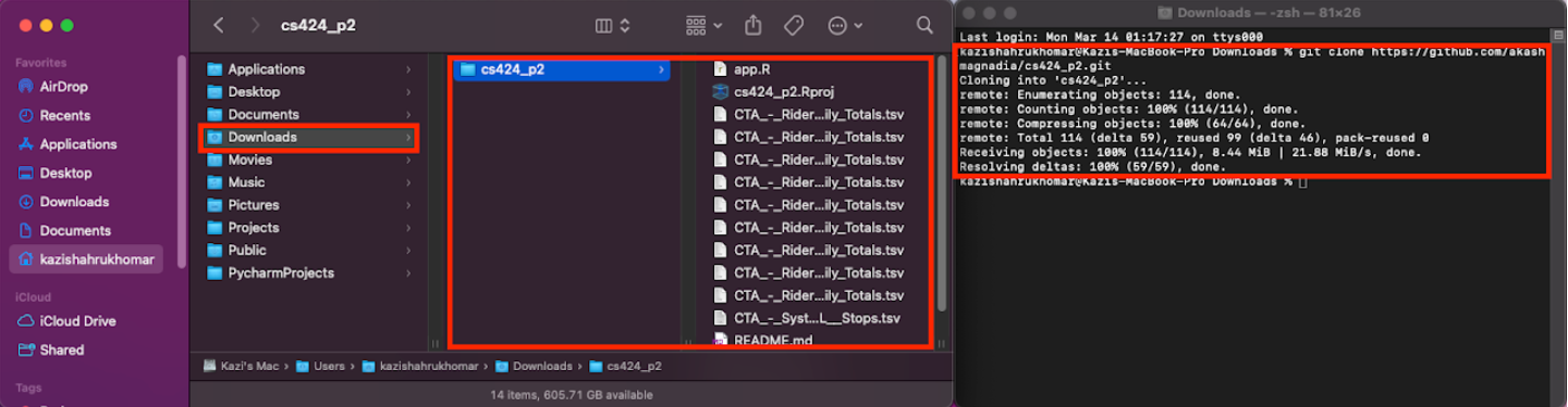
Create a folder in your local machine where you want the project to locate at.
Open the terminal and set the direction to the created folder.
Run the following commend: "git clone https://github.com/komar41/CS-424-Project-3-kzo".
Open RStudio. Go to "File" and select "Open Project". Choose the project folder ("CS-424-Project-3-kzo") that you cloned from GitHub.
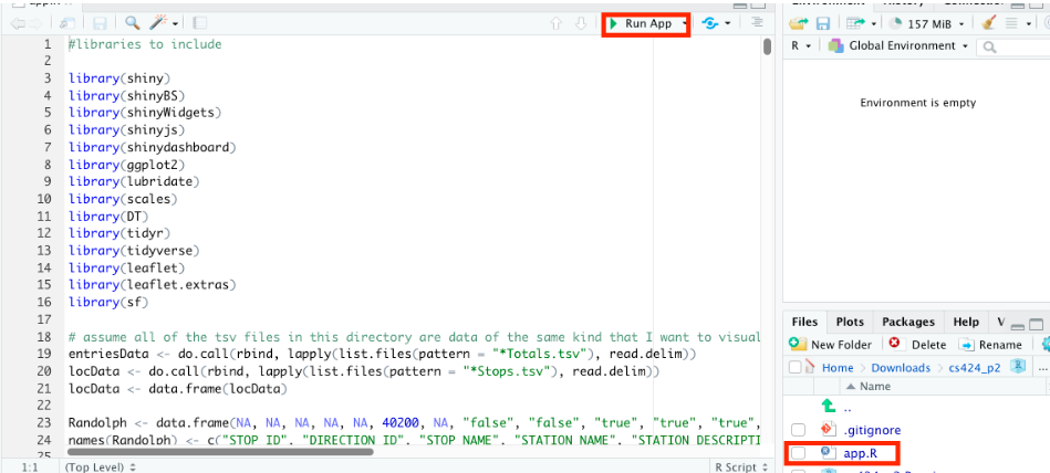
Open the file "app.R" and press "Run App" button on RStudio.
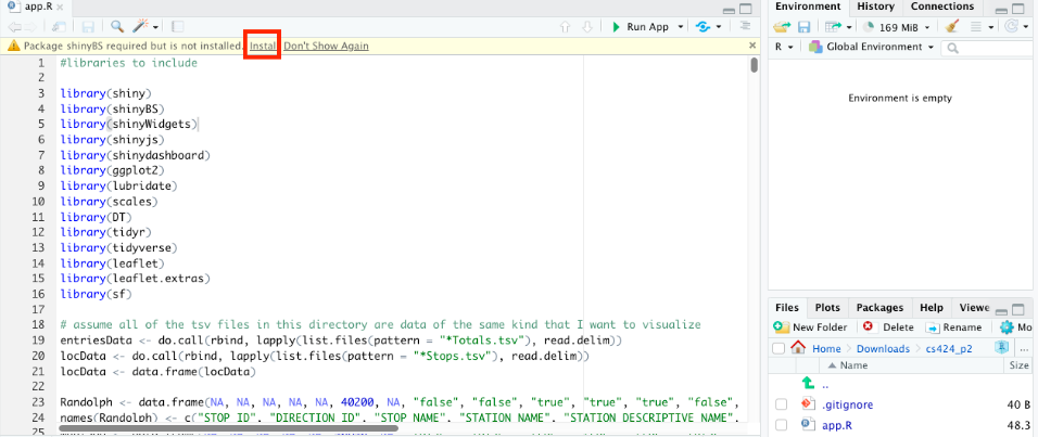
Rstudio will tell you if you are missing some packages. When the pop-up shows up, click "Install" to install all those packages.
After Installation of those packages, RStudio will start a Shiny app on your local machine.
Visualization Critique of Georgia Department of Public Health Daily Status Report of COVID-19
What Is The Purpose?
The purpose of this visualization is to show statistics related to the COVID-19 pandemic in the State of Georgia.
This visualization is created in order to inform the public about the severity of the ongoing pandemic and help officials understand how their
community is being affected so that they can shape policies to curb the spread of the coronavirus.
Having data for specific demographic helps the officials and medical staff understand the behavior of the coronavirus so that they
can allocate appropriate resources to help the most people.
What Is The Data?
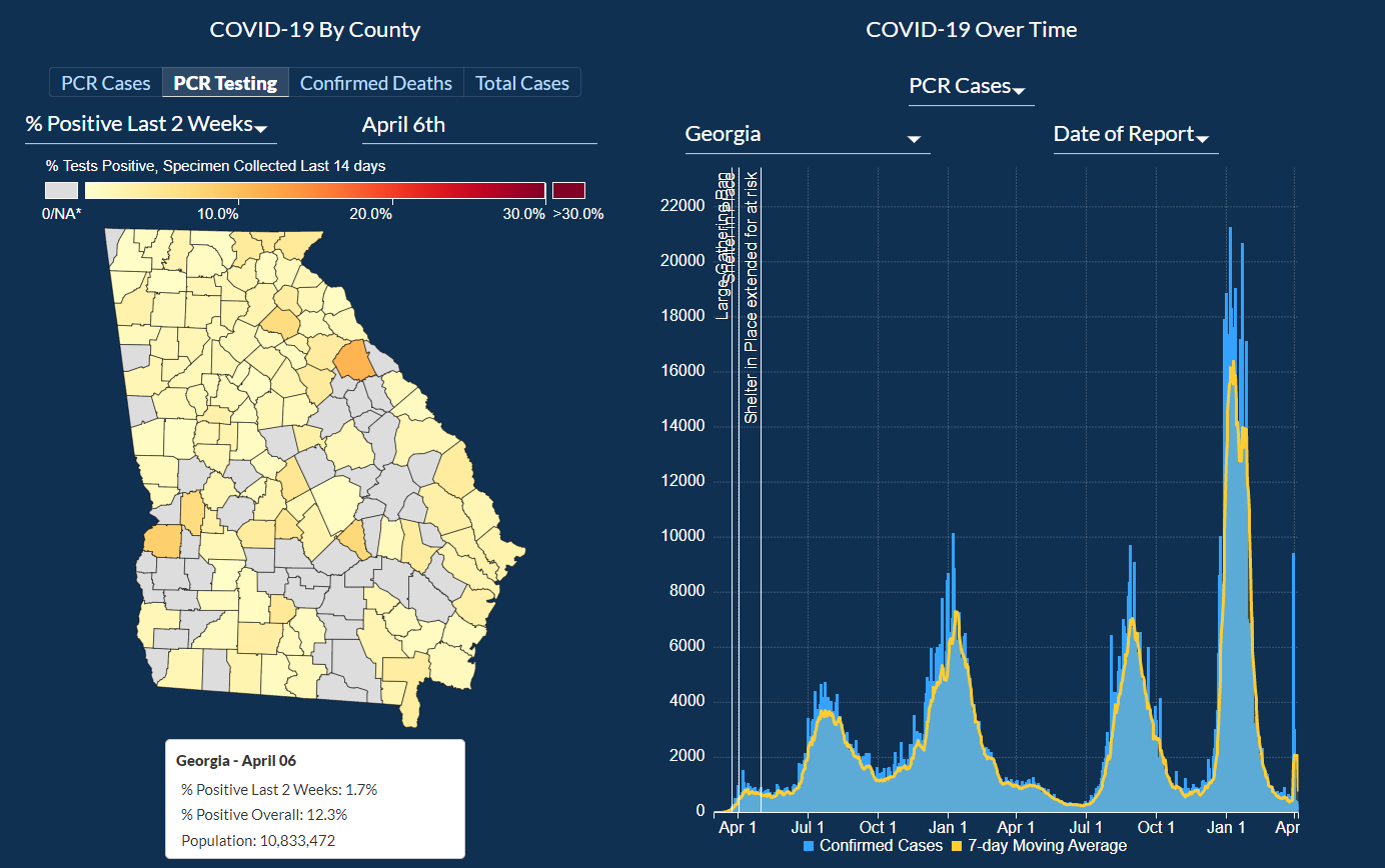
In this visualization, a user can explore information about COVID testing, Deaths, Hospitalization, ICU admissions, and Positivity Rate.
There is also a way to display this information filtered by each county, so if you are concerned about the county that you live in and
want to keep an eye on the rise of cases near where you live then you can do that as well.
There are also accumulating statistics on which types of tests were taken and information about the number of positive
tests and also the positivity rate of each of the different types of tests.
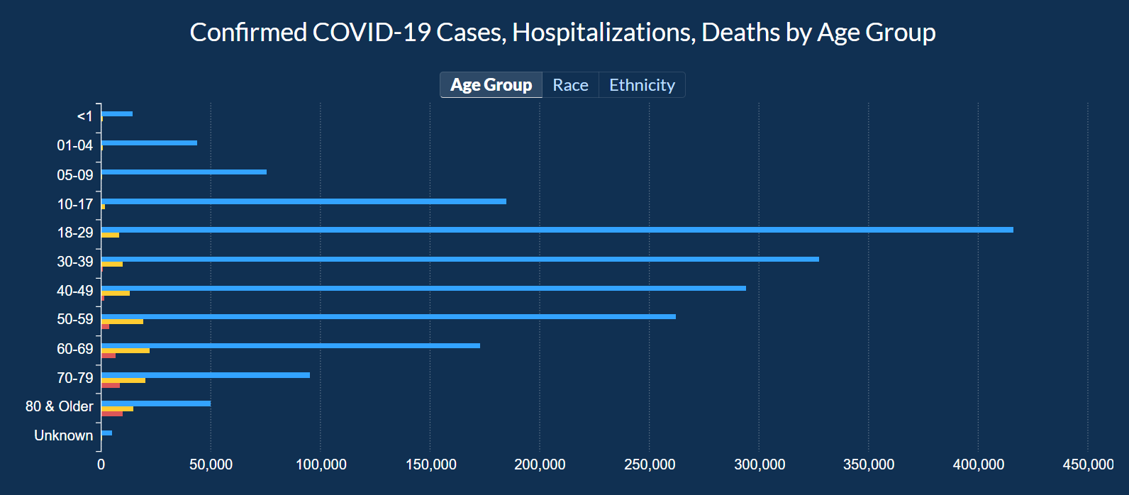
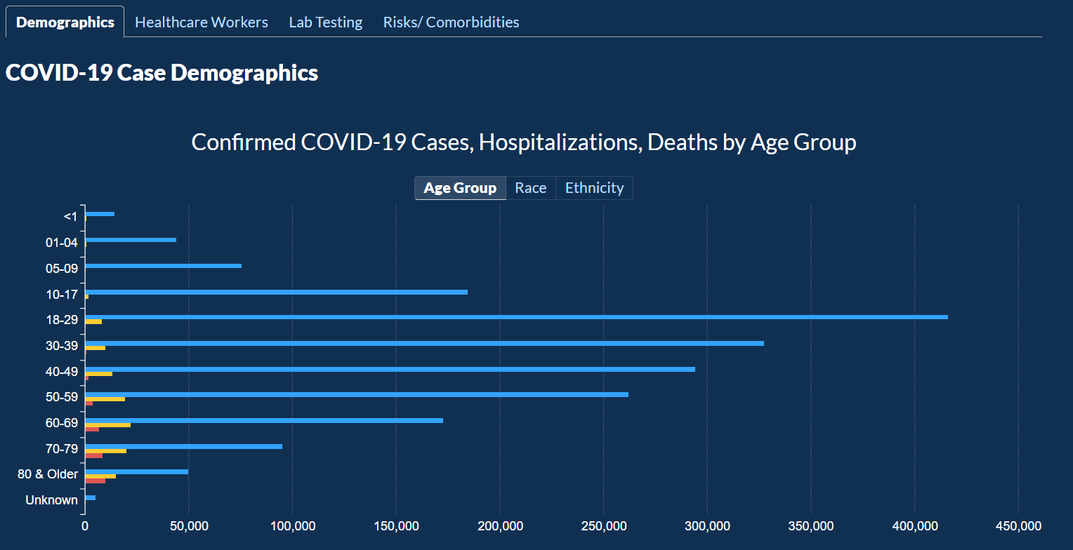
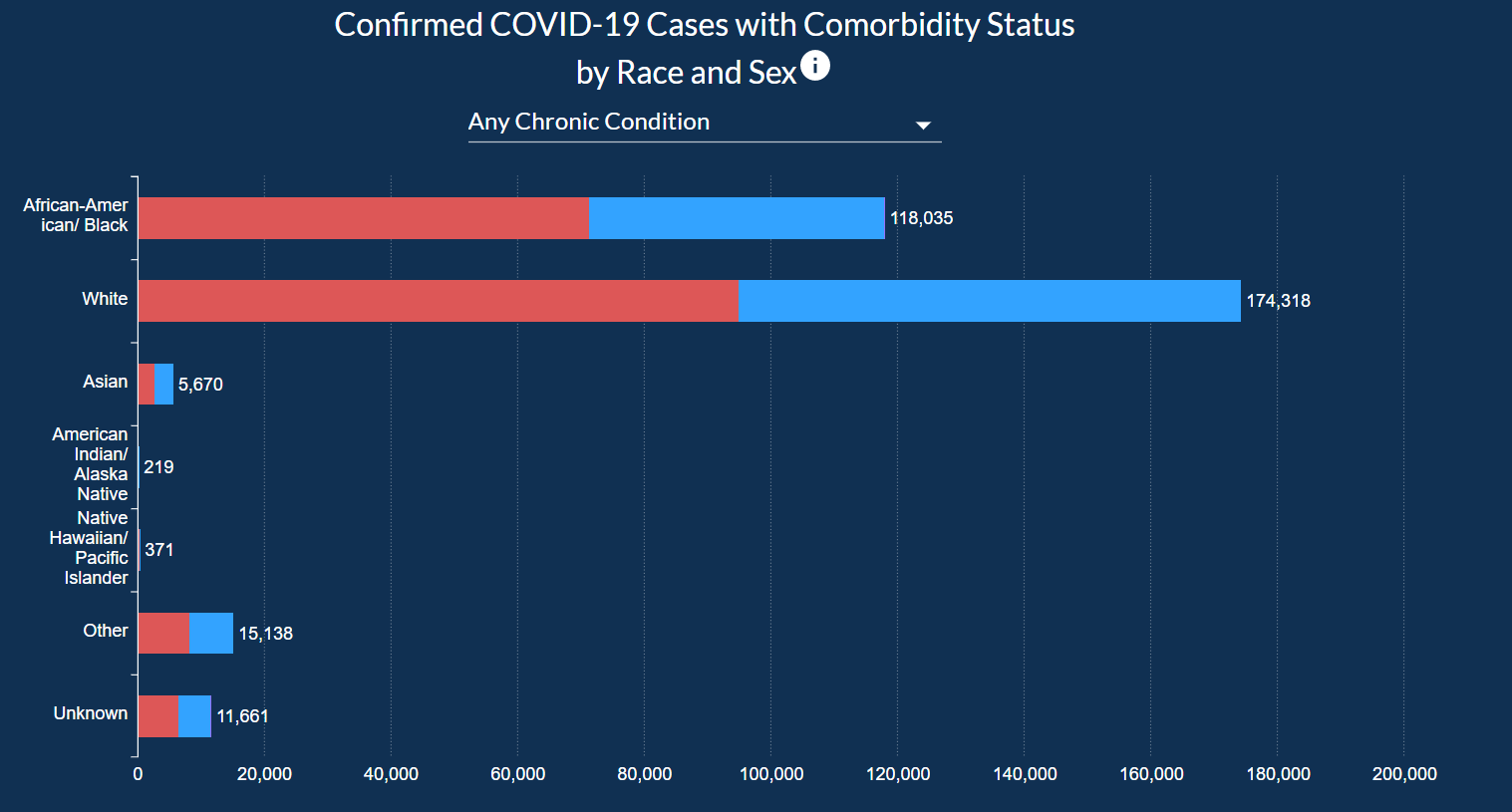
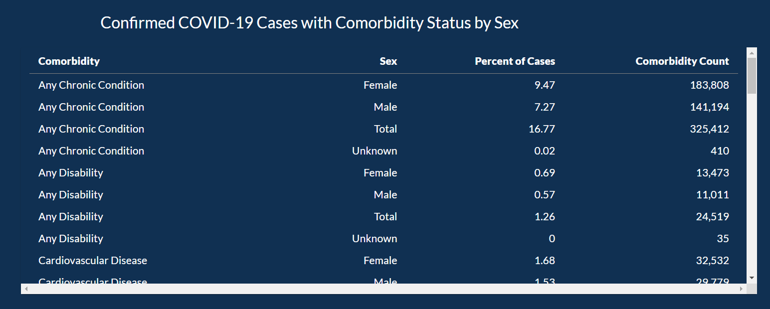
In this visualization, you can look at cases and death information based on Age Group, Race, and Gender.
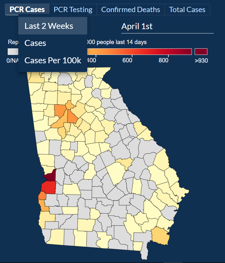
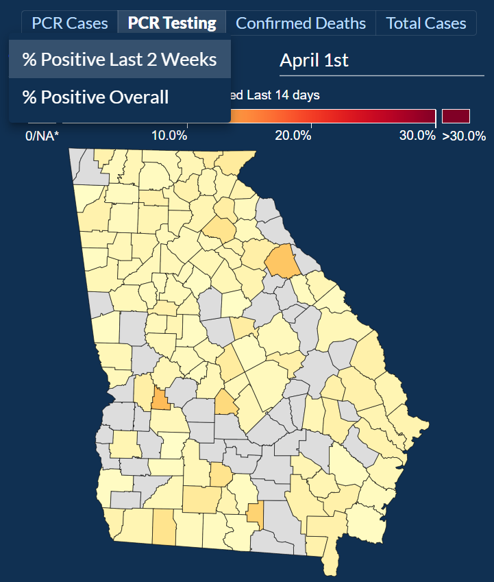
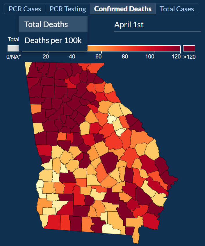
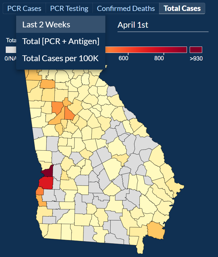
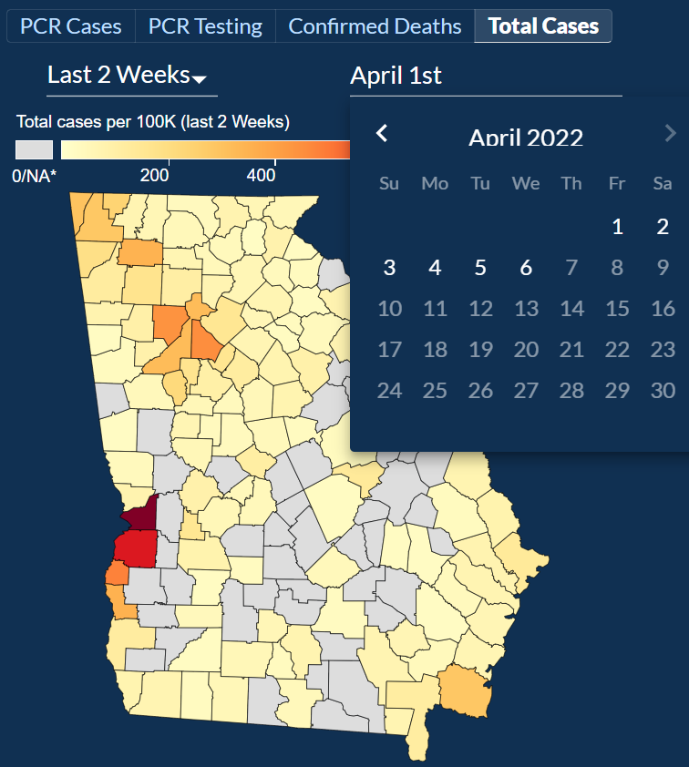
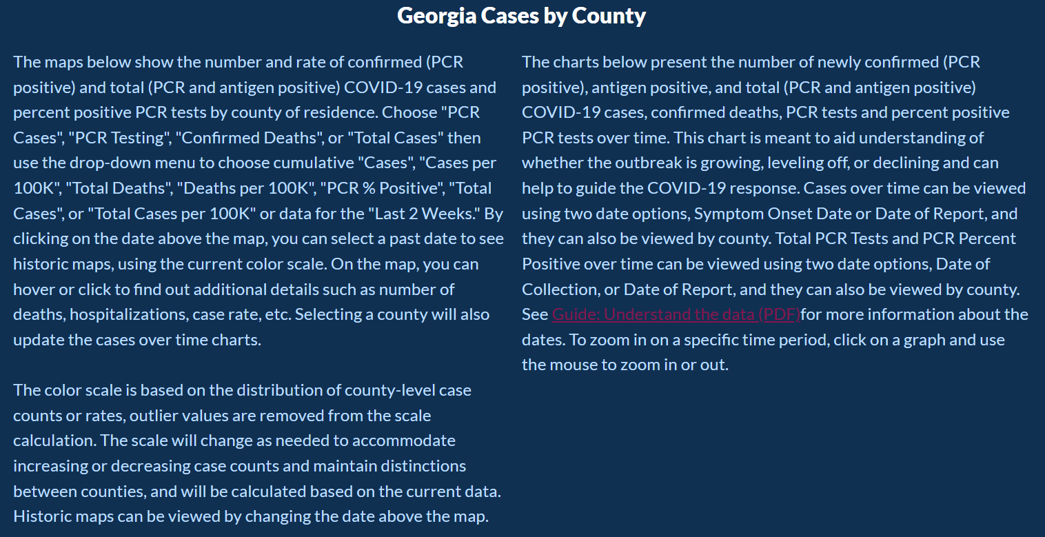
Users can explore COVID-19 data by County and check out four different categories: PCR Cases, PCR Testing, Confirmed Deaths, and Total Cases.
For each category, a day can be picked to narrow down the information about each of the categories.
For PCR Cases, the information can be further narrowed down to cases in two weeks, Total Cases, and Total Cases Per 100,000 people.
The last subcategory would help show how each county is dealing with COVID-19 compared to other counties as the data is normalized based on the population in that county.
Then by selecting PCR Testing and exploring both of their categories % Positive Last 2 Weeks and % Positive Overall, we can look at the positivity rate of each county.
Then after selecting Confirmed Deaths and exploring both of their sub-categories Total Deaths and Deaths per 100k, we can look at total deaths per county and deaths per 100,000 people, respectively.
After selecting Total Cases and exploring the three sub-categories: Last 2 Weeks, Total [PCR + Antigen], and Total Cases per 100k.
For the sub-categories, we can look at cases from the last 2 weeks, although it’s unclear if these include only PCR or PCR and Antigen test.
For the subcategory Total [PCR + Antigen], we can look at the total combined cases of both PCR and Antigen tests.
For the subcategory Total Cases per 100k, we can look at cases per 100,000 people although by the description given it’s unclear if it includes both the PCR and Antigen tests.
For each of the 4 categories, you can look chose to look at any one date ever since the pandemic started.
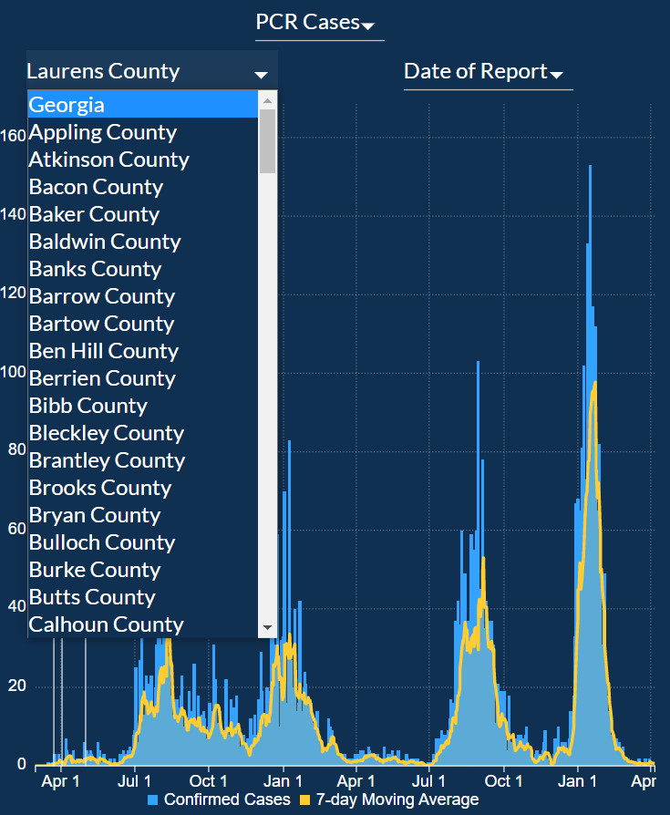
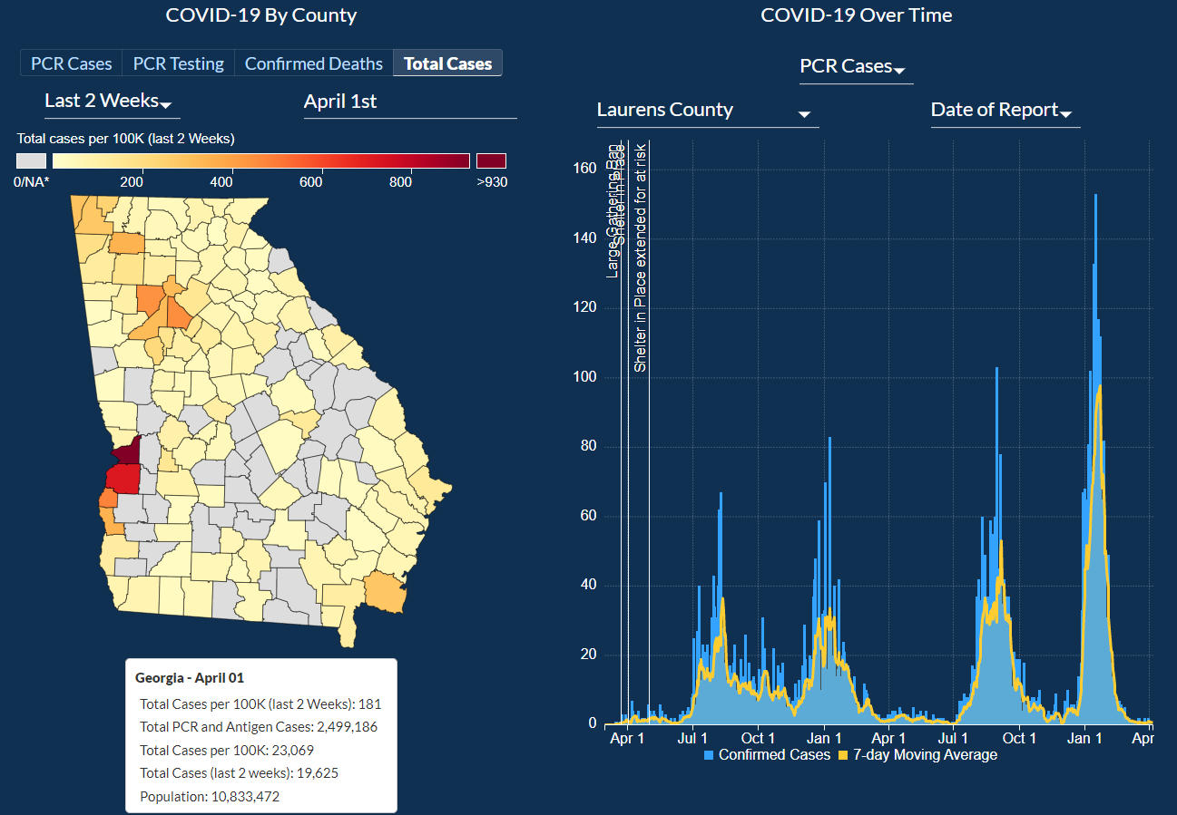
Next, we will look at COVID-19 Over Time. Here you can pick Georgia to select data from all the counties or
pick a specific county by clicking on one of them from the option picker to select the county from the map we looked at previously.
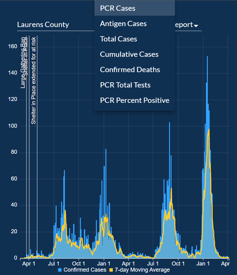
For each of the counties, the bar chart can be filtered for the following categories:
PCR Cases, Antigen Cases, Total Cases, Cumulative Cases, Confirmed Deaths, PCR Total Tests, PCR Percent Positive.
The graph can be zoomed in and zoomed out to look at specific dates more closely.
The graph also has markers that mark when the Large Gathering Ban was implemented, when the Shelter in Place order was given, and when much more.
The graph has one bar for each day and a line graph of a 7-day Moving average to create a smooth line graph.
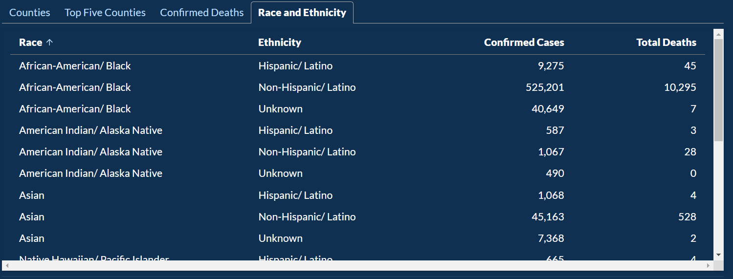
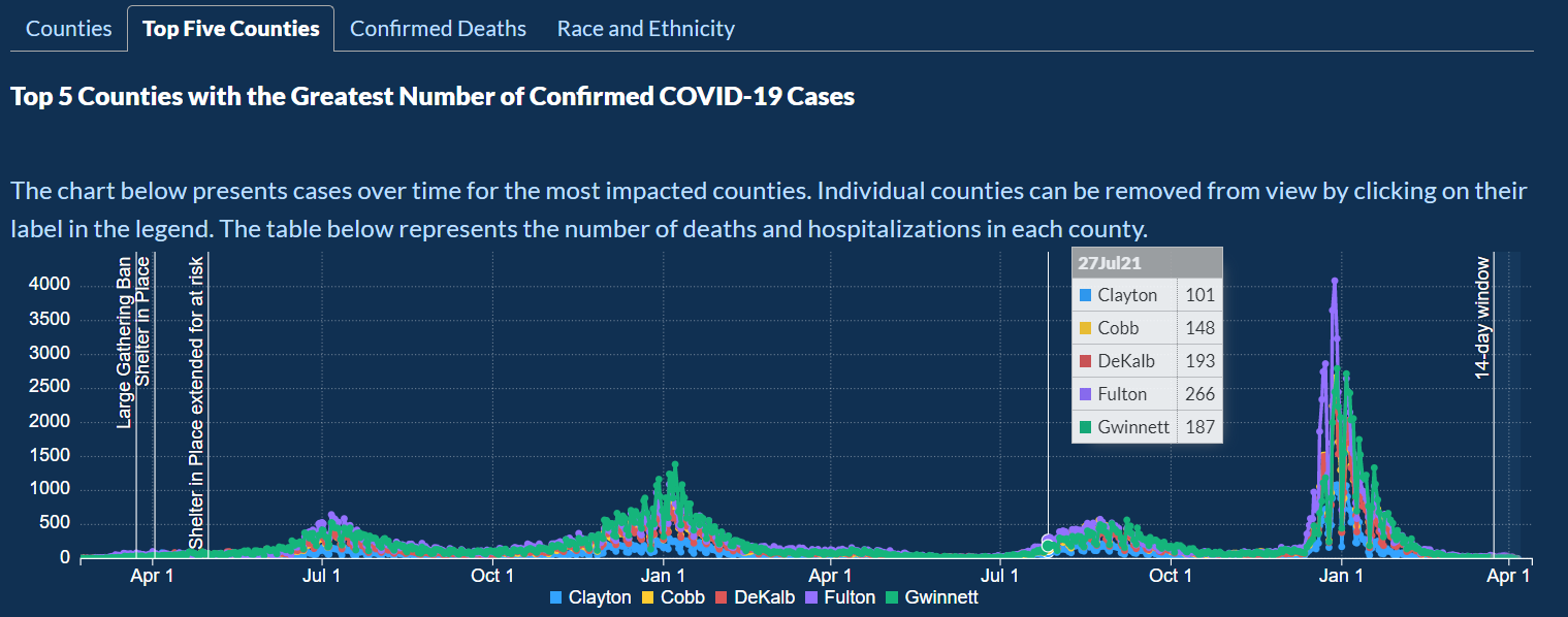
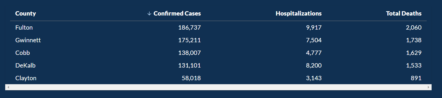
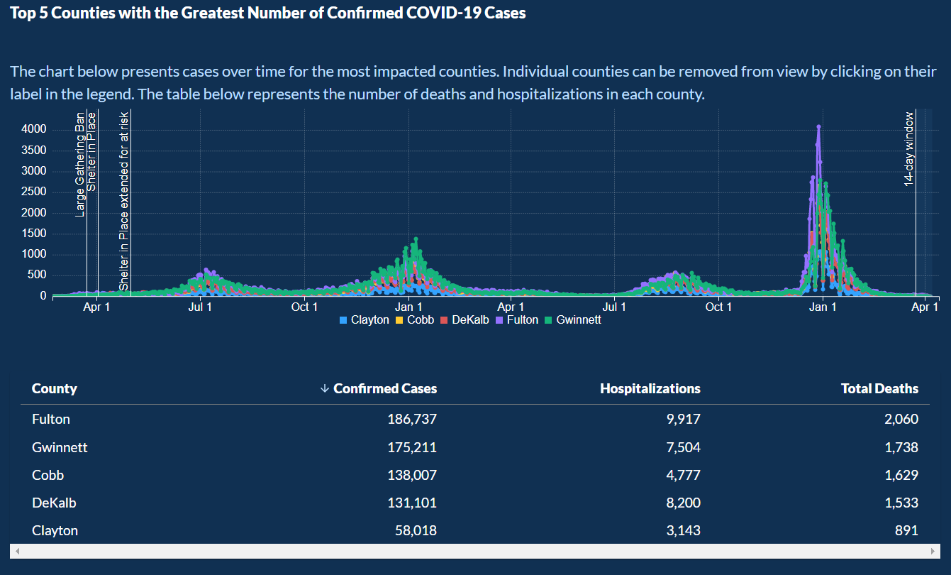
Below that there are the following 3 categories that present the data in the table: Counties, Confirmed Deaths, and Race and Ethnicity.
Then there is another category: Top Five Counties, which shows the top 5 counties with the highest cases.
Below the graph, there is a table of the data presented on the graph.
COVID-19 Case Demographics looks into data about Age Group, Race, and Ethnicity along with Confirmed Cases, Hospitalizations, and Deaths.
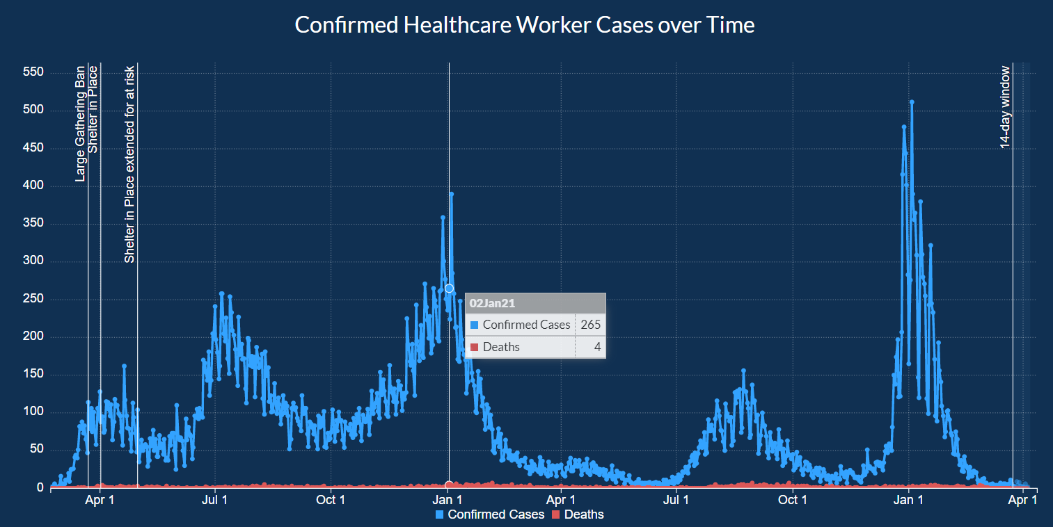
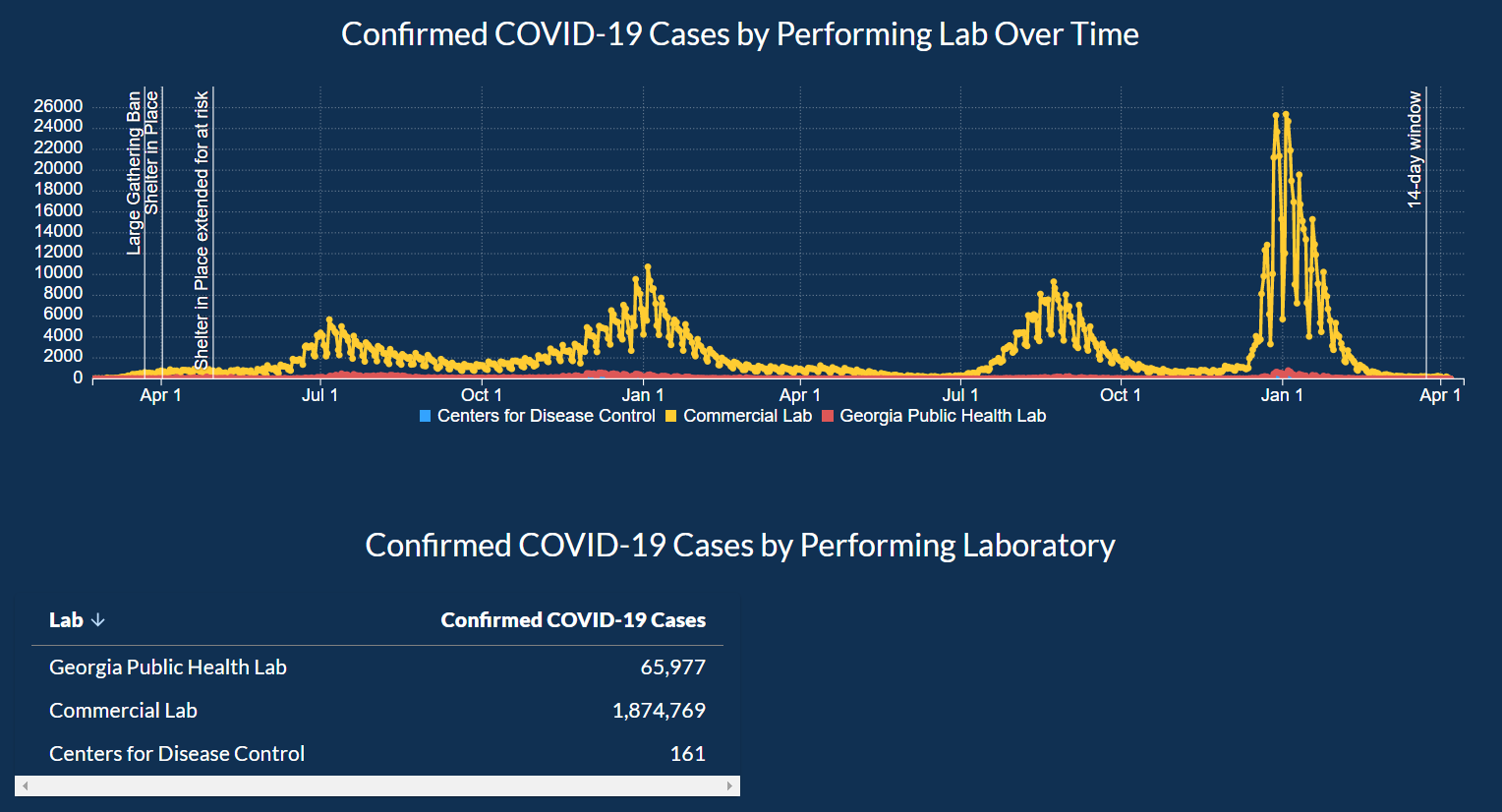
In the tab next to Demographics, there is a tab for Healthcare Worker Cases over time.
Here there are two line graphs about confirmed cases and deaths over time.
When you hover over each point, you can fetch the actual numbers for that day.
Once again, this graph also includes markers for significant events such as the Large Gathering Ban.
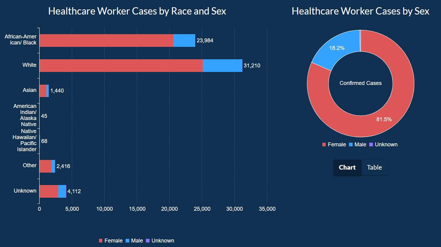
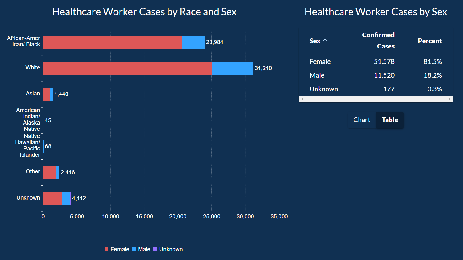
Below the graph, there is an inverted bar graph showing the cases of healthcare workers by race and gender along
with a pie chart showing the cases of healthcare workers by gender only.
The data for the pie chart can also be toggled to show it as a table as well.
When you move to the next tab Lab Testing, we can look at the graph about which lab performed how many tests that came out of being positive.
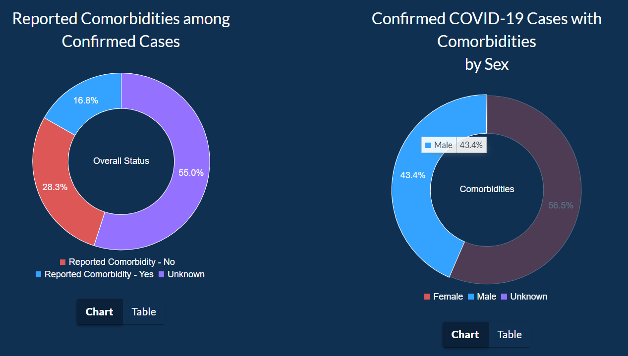
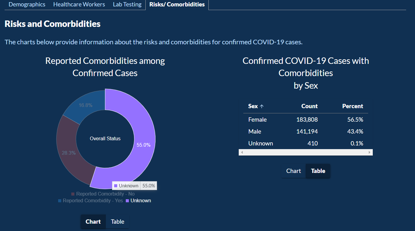
In the next tab, users can explore how chronic conditions and other complication plays into who got COVID-19 or not.
This data is shown as a pie chart between gender, as an inverted bar chart for ethnicity, and all of this data as a table as last.
How was the data collected?
The data in this visualization are the data reported to the Georgia Department of Public Health (DPH) from numerous labs, hospitals, and providers in various ways.
DPH receives data files in the format of Electronic Laboratory Reports (ELR) which contain patient identifiers, test information, and results.
Individual case reports may also be submitted through DPH’s secure web portal, SendSS, from healthcare providers and other required reporters.
Therefore, the data displayed on the DPH Daily Status Report reflect the information transmitted to DPH but may not reflect all current tests or cases due to the timing of testing and data reporting.
Click here
to open the PDF to understand the data and how to interpret it.
Click here
to download the data represented in this visualization.
The data is broken into 19 separate CSV files.
Who are the users that this visualization was made for?
The users of this data can be anyone, from residents of Georgia, research doing a case study on the COVID-19 pandemic in Georgia, or officials shaping policies to curb the spread of the virus.
It is meant for anyone interested in gaining knowledge on how the coronavirus is spreading and what counties or demographics are affected the most
so that appropriate resources can be allocated to that community.
What questions do people want to ask?
People can ask any questions related to the spread of COVID-19 in the state of Georgia. I think the most asked questions would have been:
How is the county that I am in affected compared to the counties with most cases?
How is the county that I am in affected compared to the state as a whole?
What is the difference in time periods when there were peaks in cases?
How is my age group, gender, or/and race is being affected compared to others?
What are the total cases, deaths, or even cases from recent times?
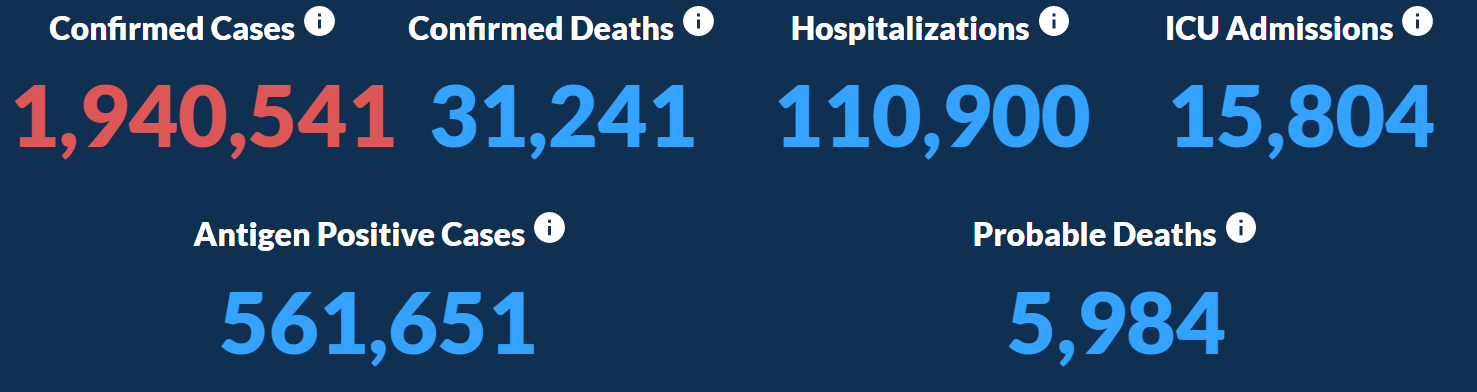
The last question can be answered towards the top of the visualization where there are important statistics in big and bold colors,
so they pop out to the user when they are looking at them. The possible questions users can ask are limited to what visualization can show,
while it may be limited it answers very important questions.
How can they find the answers with this tool?
Starting from the start, we are introduced to 6 important cumulative statistics about COVID.
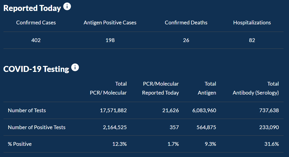
Next, there are statistics on cases, deaths and hospitalizations reported today.
Underneath which is a table of more details about the positivity rate of COVID-19 as a whole.
Then we go into more details about the county. Here we are first introduced to a paragraph about how to interpret the data on the map.
Underneath the paragraph, there is a map with 4 categories to explore the data in more detail.
Users can click on any of the counties to see COVID-19 over time for that specific county.
In the graph that shows COVID-19 over time, there are 7 categories that you can select to look at a particular set of data.
The graph is also interactable. Users can zoom in and click and hold to move between different time ranges, or zoom out to look at how COVID-19 progressed since it had begun.
Next, there are four more categories in the table of all counties,
Top Five counties with most cases along with a line graph, a table of information on confirmed deaths, and lastly information about cases and deaths per race and ethnicity.
Next, there are four more categories of demographics, Healthcare Workers, Lab Testing, and Risks/Comorbidities.
For each of the categories, the data is comprised of pie charts, inverted bar graphs, line graphs, tables, and various combinations of all of them.
What works in this visualization?
Everything works fine from a functional standpoint and all the data loads properly.
The theme and color scheme stays consistent throughout the visualization.
For example, the color for females is always red and for males is always blue.
The interface also supports visualization for people who are Green-ColorBlind or have Deuteronomy.
This is a good thing as it considers people with certain disabilities to have access to the data and does not restrict them from any information.
The line graph for COVID over time makes looking at the data more pleasing as it gives the gist of the trend without looking at each bar closely.
For different counties on the line graph, there are different colors used with legends.
When a user hovers over the legends that pacific set of data is highlighted.
For any of the data formats except for tables, users can hover over a bar for a bar chart, a portion of the pie for a pie chart, and a line point in a line graph to get more details information.
This is a helpful feature for anyone who would like to go dig deeper into COVID-19 in Georgia.
What needs to be improved in this visualization?
The pie chart should include how many healthcare workers got tested because the pie chart implies that males are less likely to get COVID-19 than females while working in the healthcare industry.
A better way to show this information would be to show the positivity rate of both genders.
There is also no way to select a range of dates for the bar chart and map to see how the spread of the virus changed over a period of time.
UI feels sluggish when interacting with it.
This is possibly due to having many graphs and charts loaded on the screen at the same time.
After selecting confirmed deaths, it takes a good 15 seconds for the table to load in.
As a user, it felt like the visualization had crashed. Another thing that needs improvement is pie chart loading in when clicking on Risks/Comorbidities.
When clicked, the pie chart loads in with an animation where it gets bigger,
but this animation is stuttering and the user can’t properly read the information for 5 seconds, the time it takes for the animation to complete.
On the line graphs, there are important markers placed towards the date of the beginning of the pandemic, but then there are no markers placed afterward.
This is an overlooked detail as there were many significant policy changes made during the span of the pandemic which made the pandemic
worse or better due to those policy changes.
These markers would help the residents understand how effectively the government and officials are working to help them.
These missing markers would have enhanced the visualization.
Examples of these significant missing events include: when vaccination efforts started, when vaccination was mandatory for international travel,
when the lockdown was placed, and when it was lifted as well as when new variants of the coronavirus emerged.
Another limitation I felt while looking at the line graph was that there is no way to select a specific county and compare cases between two counties or state as a whole.
There is also missing a feature to add positivity rate, deaths, or hospitalizations in the graph.
There are also no vaccination statistics present as that is the most important reason that has helped so many lives.
To me, it feels like this graph was created to paint a pretty picture and to obscure some facts to make the response to the pandemic look great.
I believe that this goes against the ethos of creating visualization to convey the truth.
Therefore, this visualization needs to be able to convey the truth in an accurate way without distorting the image by only showing selective information.
Use this area to describe your project. Lorem ipsum dolor sit amet, consectetur adipisicing elit. Est blanditiis dolorem culpa incidunt minus dignissimos deserunt repellat aperiam quasi sunt officia expedita beatae cupiditate, maiores repudiandae, nostrum, reiciendis facere nemo!
Client:
Southwest
Category:
Website Design
Project Name
Lorem ipsum dolor sit amet consectetur.
Use this area to describe your project. Lorem ipsum dolor sit amet, consectetur adipisicing elit. Est blanditiis dolorem culpa incidunt minus dignissimos deserunt repellat aperiam quasi sunt officia expedita beatae cupiditate, maiores repudiandae, nostrum, reiciendis facere nemo!